|
|
 Re: Untitled Platformer - Artists' corner
[Re: ratchet]
#336528
Re: Untitled Platformer - Artists' corner
[Re: ratchet]
#336528
08/04/10 20:07
08/04/10 20:07
|
Joined: Oct 2006
Posts: 470
Balkan
Ganderoleg

Senior Member
|
Senior Member
Joined: Oct 2006
Posts: 470
Balkan
|
Hello team, I've uploaded new level for J, J & BUM Fortress Chapter (Chapter 3 Level 6) to SkyDrive. Unfortunately my pc finally died few days ago in spite of my two weeks attempt to revitalize it. I managed to put together, combining my old pc's parts, a 700 Mhz machine that I am using now until I buy a new computer in about a week. This means that I'm very limited in my game-related work (can't force anti-aliasing, can't run ppe, shaders are working very strange & everything is functioning somewhat slow  ). The level is not finished, specially in terms of gameplay, since there are some crucial AI aspects missing and also the level would need few more graphical improvements. George contributed with code solutions for doors, bonus items & early bonus system code. Since my anti-aliasing is not functioning on this, rudimentary, computer  I decided not to display too many screenshots but only three: 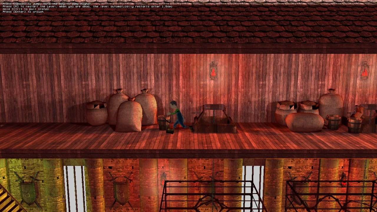 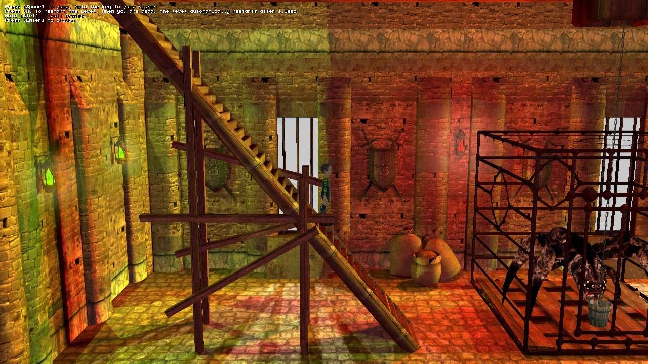 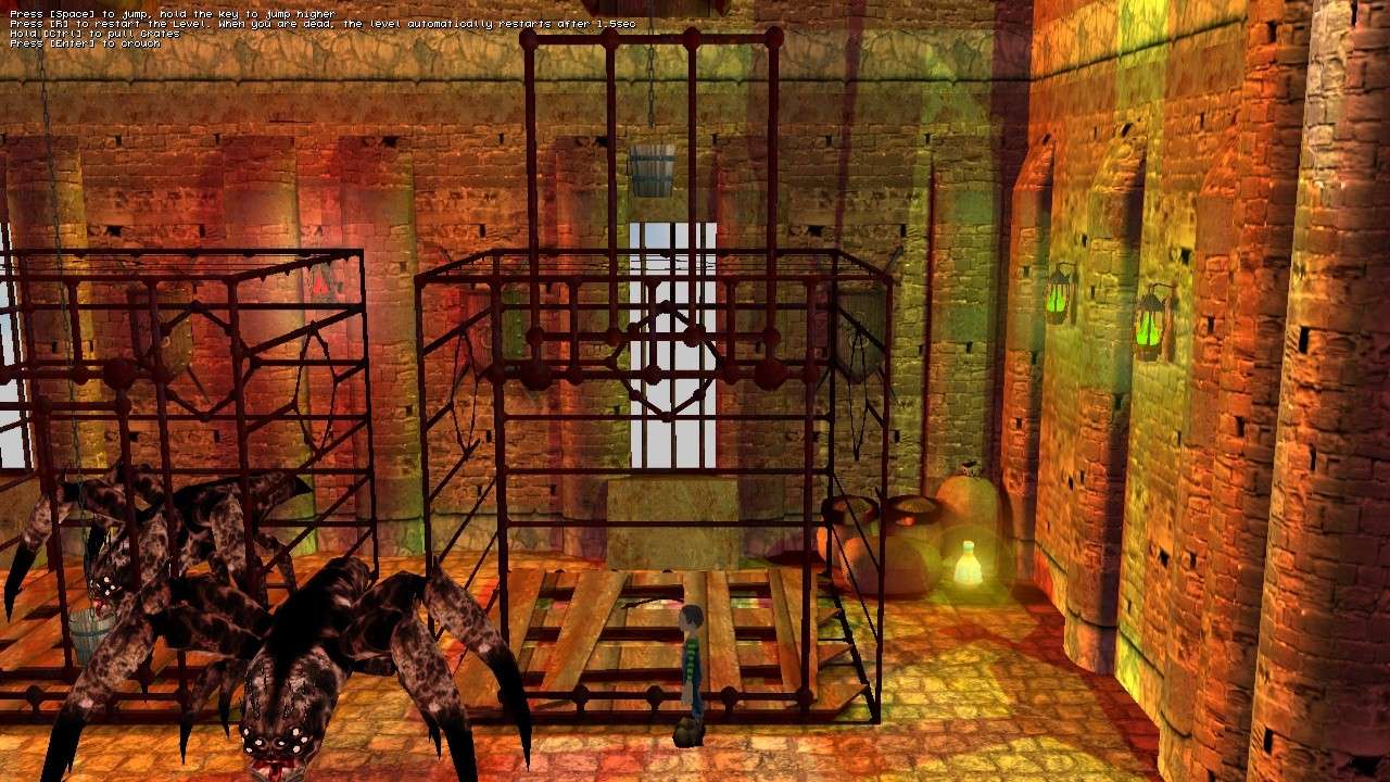 Any feedback on what should be changed & modified is welcome... >Ganderoleg<
|
|
|
Re: Untitled Platformer - Artists' corner
[Re: Ganderoleg]
#336533
08/04/10 20:57
08/04/10 20:57
|
Joined: Sep 2003
Posts: 5,900
Bielefeld, Germany
Pappenheimer
Senior Expert
|
Senior Expert
Joined: Sep 2003
Posts: 5,900
Bielefeld, Germany
|
Just a short feedback about the light in the levels:
Try to look at the screenshots when they are scaled to a minimum when it becomes difficult to 'understand' what's on the pictures. Then ask yourself whether it looks still interesting, whether it has a unique shape relating brightness and shadows and colors.
Maybe, this is for later, after finishing the levels and their mechanics, but to make your levels perfect, you should aim for unique places with a unique composition of colors, mood and light.
Maybe, looking for painted frames of adventure games is the best way to get ideas on how to improve such things.
Sorry, this feedback is a bit fragmentary, hope it is clear what I mean.
Last edited by Pappenheimer; 08/04/10 20:58.
|
|
|
Re: Untitled Platformer - Artists' corner
[Re: Pappenheimer]
#336552
08/04/10 22:38
08/04/10 22:38
|
Joined: Oct 2006
Posts: 470
Balkan
Ganderoleg
Senior Member
|
Senior Member
Joined: Oct 2006
Posts: 470
Balkan
|
Thanx for checking out the project It's not very conclusive from the static screens but there are carefully arranged light-layers that follow each room/outdoor level part, enhancing the depth of the environment. In these screens you can see how I used color contrasts to achieve the foreground/background effect... 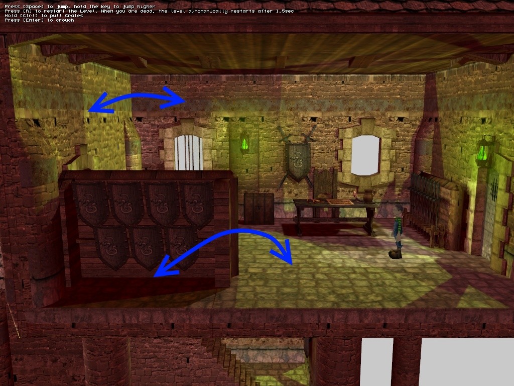 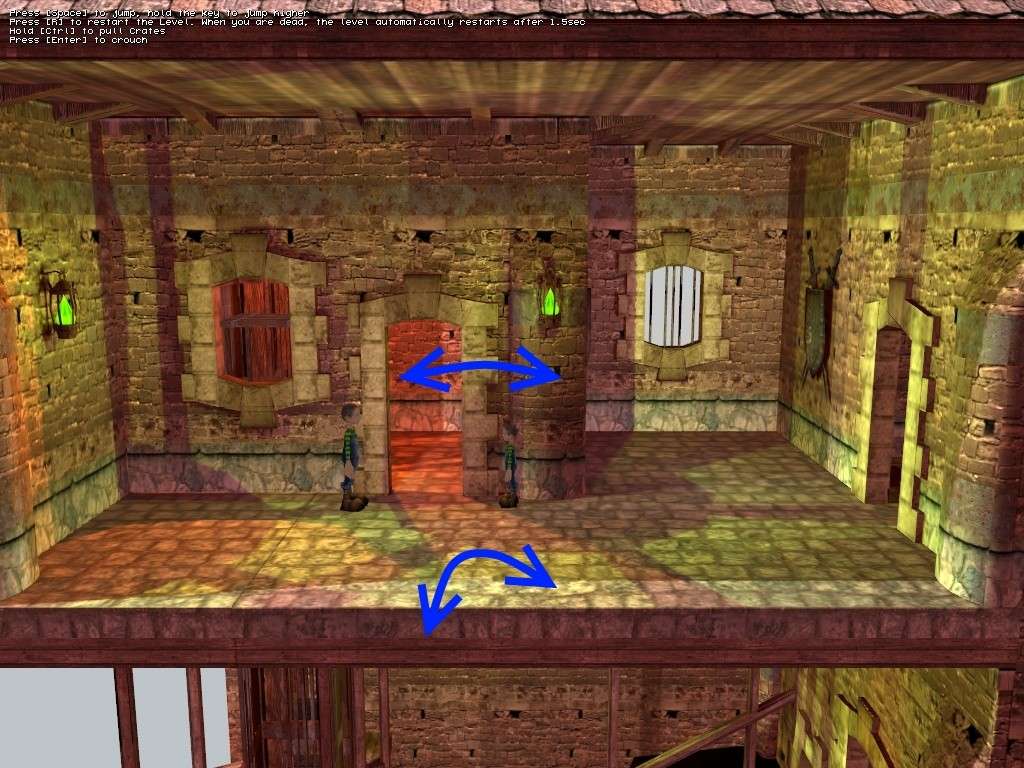 In this picture the stairway & cages are dominating the shot because the other environment is much less contrasted. Even the stairways themselves have foreground/background layer... 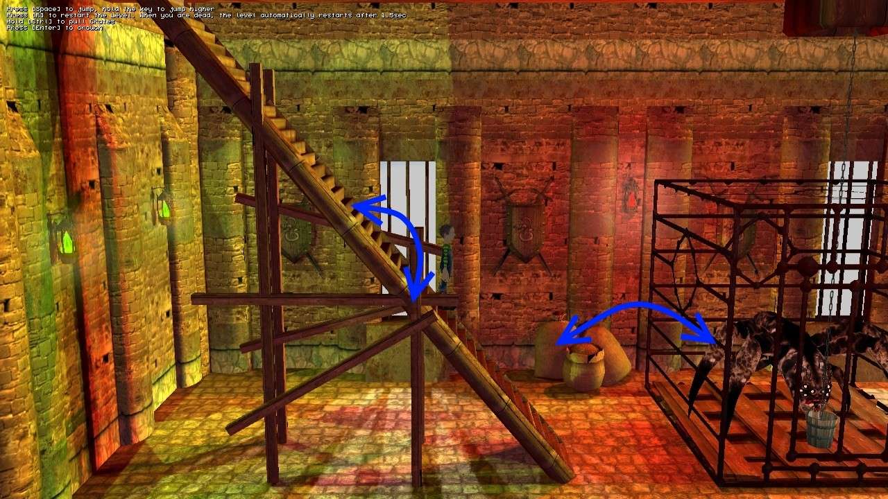 I, naturally, contrasted the level parts by color as you mentioned & created different moods & feels depending of the room character. In these levels (chapter 3 : Fortress) I have green & red as a main environment dividers. I realize that this way of level lighting is not really orthodox (and it's a bit experimental) but it has been making a good impression on people that have seen it. It's the first thing they notice & like about the game. As I mentioned the screens are not really that conclusive, the levels should be experienced in motion to get the real impression on the efficiency of the light/color scheme. Once you see it in motion, the light concept is much more straightforward & clearer
|
|
|
Re: Untitled Platformer - Artists' corner
[Re: Ganderoleg]
#336554
08/04/10 23:02
08/04/10 23:02
|
Joined: Sep 2003
Posts: 6,861
Kiel (Germany)
Superku
Senior Expert
|
Senior Expert
Joined: Sep 2003
Posts: 6,861
Kiel (Germany)
|
Sorry to hear that regarding your computer! I really like (almost love  ) the color scheme in your levels, I would not change it at all.
"Falls das Resultat nicht einfach nur dermassen gut aussieht, sollten Sie nochmal von vorn anfangen..." - Manual Check out my new game:  Pogostuck: Rage With Your Friends Pogostuck: Rage With Your Friends
|
|
|
Re: Untitled Platformer - Artists' corner
[Re: Superku]
#336559
08/04/10 23:41
08/04/10 23:41
|
Joined: Sep 2003
Posts: 5,900
Bielefeld, Germany
Pappenheimer
Senior Expert
|
Senior Expert
Joined: Sep 2003
Posts: 5,900
Bielefeld, Germany
|
Thanks for clarifying your concept. I see that there is already a lot of work done relating the lights, maybe, the shadow light difference is - relating to the light and contrast settings of my monitor - simply too weak. But, I normally have the problem of screenshots in this forum being too dark. Just a fast modified screen of yours. I mainly drowned the dark corners in black(they are too dark now, but it was a fast test only), changed some light colors, put sort of sprites on the lights like the window, and covered the floor below in black - don't know whether it were possible ingame, but it is nice, because it avoids distractions from the main room where the player actually is playing.  Don't know whether you consider it as an improvement, though.
|
|
|
Re: Untitled Platformer - Artists' corner
[Re: Pappenheimer]
#336564
08/05/10 00:11
08/05/10 00:11
|
Joined: Oct 2006
Posts: 470
Balkan
Ganderoleg
Senior Member
|
Senior Member
Joined: Oct 2006
Posts: 470
Balkan
|
Aa now I see what you mean. Yes, the general light contrast is a bit on the bright side  There is no totally black areas but the player will be able to set the brightness & alpha levels through the game menu. The higher ambient values, in my opinion, keep the game visually more colorful, cartoony &, let's say, benign. If we decide along the way to go into a bit more �realistic� or darker direction, I will change light values & also make much stronger ambient occlusion map (ao seems to add that �serious� touch to the visuals ) Btw the hdr/bloom is still not tweaked and, therefor, not present in any of the screens. Once I tweak it & implement it, things will look more moody
Last edited by Ganderoleg; 08/05/10 00:15.
|
|
|
Re: Untitled Platformer - Artists' corner
[Re: Ganderoleg]
#336672
08/05/10 17:22
08/05/10 17:22
|
Joined: Apr 2008
Posts: 2,488
ratchet
Expert
|
Expert
Joined: Apr 2008
Posts: 2,488
|
Yes the overpainted picture show that simplified lightmaps can make the level clearer. Perhaps give a very short range to spots lights, and keep only one directionnal light for all the room ? And by simply change the main directionnal light direction , you can avoid having too many light map shadows on screen :  In Uncharted , the main floor and walls where the player will go are not covered by lot of shadows to keep things clear ! A point i found is the colors of lights : The green seems to come from the gems on the wall : make them light with a small radius, they should not lighten the room only the wall. And for the red color, why red ? i htink it's more appropriate for some fire camp or in a submarine, or a total magic level ! Here it begins to be 2 special colors : red and green , for design don't mix too much unrealistic colors ,unless it's a really magic level ! Juts my personnal taste only, each people have it's own taste always,each of us will see the perfect game in a different way ! so don't take account a lot from my suggestions or other people suggestions  Well , even like that , it's good and the actual lightmaps make it looks professionnal. Keep up the good work !
|
|
|
Re: Untitled Platformer - Artists' corner
[Re: ratchet]
#336746
08/05/10 22:41
08/05/10 22:41
|
Joined: Oct 2006
Posts: 470
Balkan
Ganderoleg
Senior Member
|
Senior Member
Joined: Oct 2006
Posts: 470
Balkan
|
@RatchetI understand that lighting could be more conventional if shadows would be toned down, with less contrast & smaller radius, but I didn't want conventional shadows for this project. The screen you posted is great but Uncharted visual style is very far from J, J & BUM concept. This project doesn't rely on realism, don't have blood, don't even have straightforward(face to face) confrontation between players & enemies You probably watched Disney's 101 Dalmatians cartoon but to see what I mean go here: http://mayersononanimation.blogspot.com/2008/07/101-dalmatians-part-15.html ...the color in 101 Dalmatians & similar style cartoons (Sword in the stone, Rescuers, Robin Hood...) is, besides the general lighting, also used to point out the feel of the room or dramatic moment. They all have very hard shadows, very contrasted color scheme. This, or more precise similar to this, is what I wanted for J, J & BUM. I didn't want to create for J, J & BUM lighting that would look realistic in conventional sense(like in games that are going for realistic approach) & didn't want to make another generic children game with almost no shadows & cute, rounded scenery. I believe that this lighting concept looks interesting & that it could make this project standout when it's screens are compared to screens of other games. I don't think there will be much problems when it comes to recognizing the shapes & depth of the environment because, once in motion, it's very clear where player can/cannot go. I never seen anyone hit a wall or fall down the stairs when playing these levels & I showed the game to lots of my friends, some of them don't even play games & they managed the movement of the main characters very easy.
|
|
|
Re: Untitled Platformer - Artists' corner
[Re: Ganderoleg]
#336854
08/06/10 16:25
08/06/10 16:25
|
Joined: Apr 2008
Posts: 2,488
ratchet
Expert
|
Expert
Joined: Apr 2008
Posts: 2,488
|
Indeed the game have a unique style. And like i said, it's already beautifull, and surely, the game don't need to be standard. It's good like that indeed. Check this platform game , when i talk about details , we can see there a lot in the level : lot of plants,flowers and palm trees. platform game Be inspired and bring on details on outdoor levels ! Keep it up !
Last edited by ratchet; 08/06/10 21:13.
|
|
|
Re: Untitled Platformer - Artists' corner
[Re: ratchet]
#340422
09/04/10 01:06
09/04/10 01:06
|
Joined: Oct 2006
Posts: 470
Balkan
Ganderoleg
Senior Member
|
Senior Member
Joined: Oct 2006
Posts: 470
Balkan
|
Hi team, I've uploaded new level for J, J & BUM Fortress Chapter (Chapter 3 Level 5) to SkyDrive. Everything is still wip (naturally) specially in terms of gameplay, since there are some crucial AI aspects missing and also the level would need few more graphical improvements. In this level Big J should receive the Illusion Spell potion from the mouse (wizard) that would allow her to attract guards attention in order for Little J to hide inside the hollow barrel. Level is a bit poly-heavy so if we decide that the poly amount is unacceptable I'll try to replace some of the items (mdl's) with sprites & see how that works for the level. The level comes with three music themes created by Dimme. There is also one new audio effect made for bonus item. I will upload the gameplay video tomorrow since now is 3:00 in my country  Any feedback on what should be changed & modified is welcome. Here are few screens for fun: 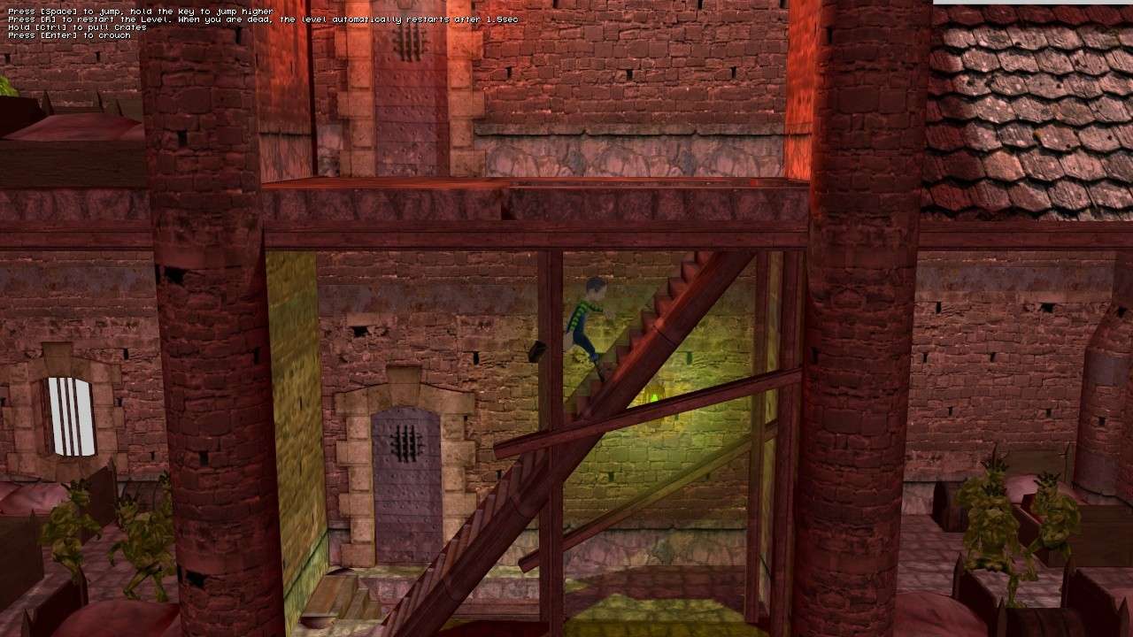 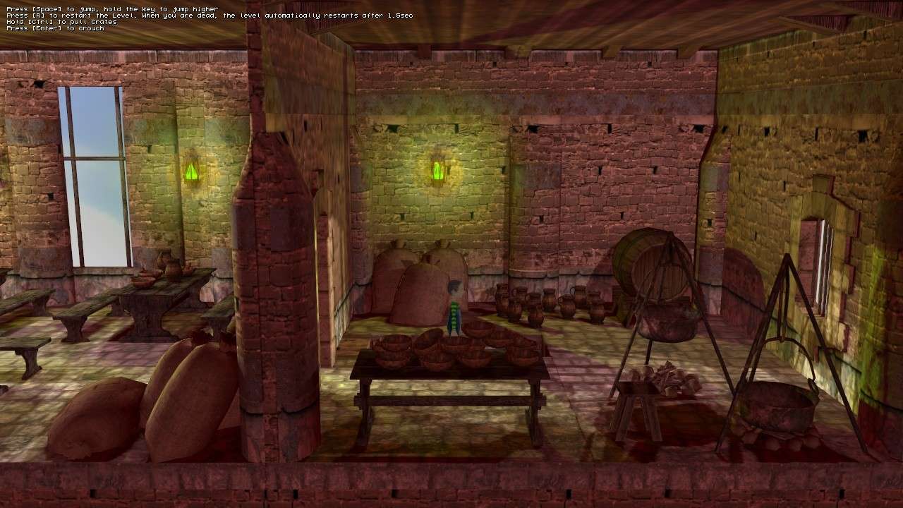 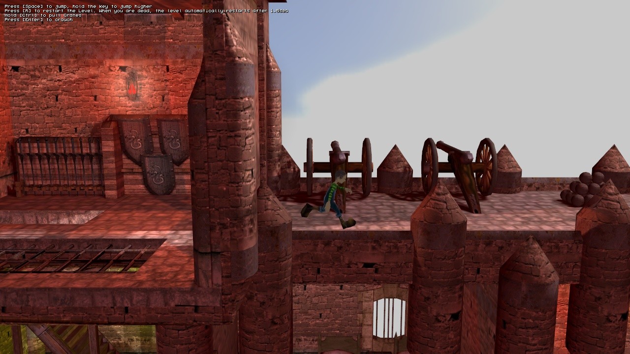 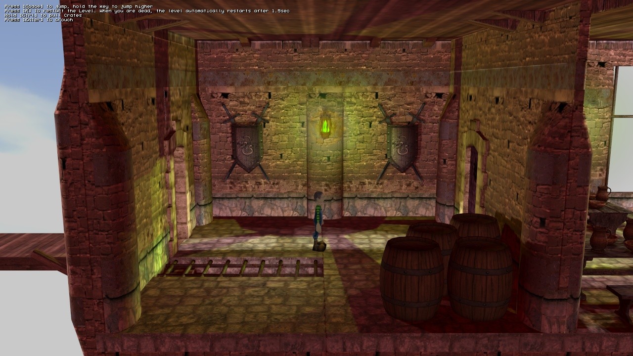 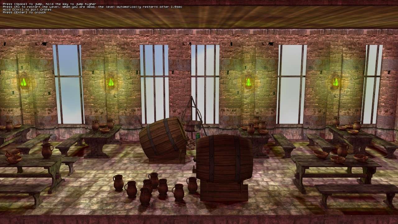
|
|
|
|


")


