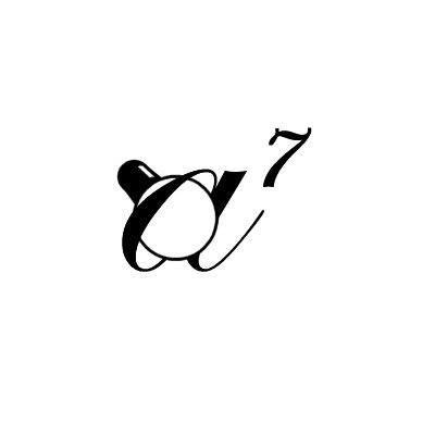
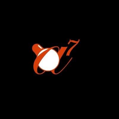
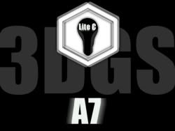
A7 logo contest
Posted By: jcl
A7 logo contest - 01/19/07 16:41
I just looked at the calendar and noticed that it's 2007, and thus time to plan for A7!
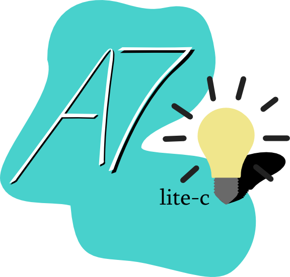
Well, for A7 we'll need a new engine, and a new logo image. We'll provide the engine and you the logo. The A6 logo contest some time ago was a great success, so let's hold a new contest for A7! Just as last time, the contest winner whose entry we use for the logo will get a free A7 Pro upgrade.
We'll need a light and a dark image. The light version is for white background and the dark version for black background. At the borders the image should fade to white or black so that you can paste it on a background without visible border (unlike the current logo).
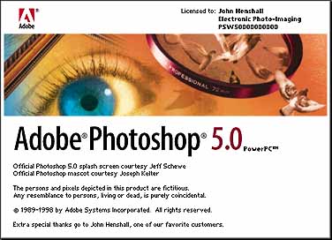
The image also should be a different format than the A6 logo. It will be displayed not at the beginning of the game, but on the top of the engine startup window and on the WED and MED about boxes. Thus it should be long, like a banner. When you've seen the Photoshop splash screen you'll get the idea.
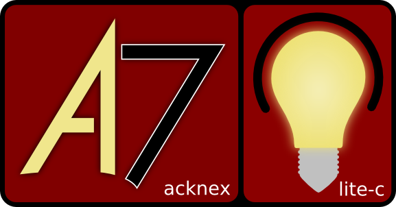
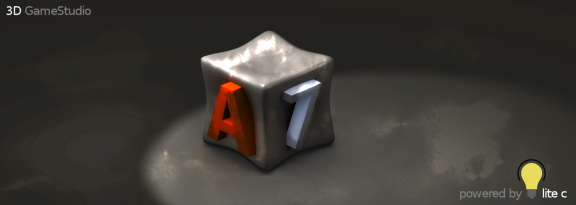
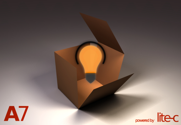
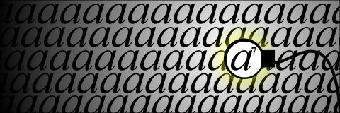
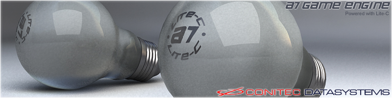
We only have two requirements for the content. We need an "A7" of course, and we need at least one light bulb somewhere in the image. The light bulb stands for lite-C, like this:

However this is just a suggestion. Your light bulb can look different, and also how the "A7" looks is up to you, as well as if and what else you place in the image.
Please post your image proposals to this thread! The winner will be determined in one month from now on, that's February 19th.
Posted By: broozar
Re: A7 logo contest - 01/19/07 16:48
great news. is there a restriction how many images i can enter? can you give a rought image dimension, please?
hmmm...seems interesting, if i have the time i will also enter this contest
Posted By: Joozey
Re: A7 logo contest - 01/20/07 10:31
So it should be wide and a small height?
If so, I made 2 logos to suit the needs.


Not sure if I showed the lightbulb well enough but I might be able to change that if it does not competent to the needs.

Regards,
Jostie
Posted By: Germanunkol
Re: A7 logo contest - 01/20/07 16:37
Hey, sweet! man, maybe I shouldn't enter. It would make me look bad

uhm, realspawn... looks great! But I'd show some other keys around the key. part of the keyboard. In a different color, fading into the background maybe. it would make sure everyone sees what it's supposed to be...:)
Looks cool, both of you!
Micha
Posted By: bstudio
Re: A7 logo contest - 01/20/07 16:57
wow, if i wasn't such a bad designer I might have entered. but I suck at creating logo's
so am i, well, i have one concept:
(think of ILM's logo)
i can resize it or move it around to fit anyway you wish, it would be nice to have an exact image dimension, i don't have photoshop so i'm not sure what you mean, but anyway, if i am allowed to do more than one entry than i will be back with another soon
Posted By: aztec
Re: A7 logo contest - 01/20/07 17:55
Got to say I really love jostie�s Design

Posted By: broozar
Re: A7 logo contest - 01/20/07 19:25
lads, you got one MONTH to go...
Posted By: bstudio
Re: A7 logo contest - 01/21/07 09:38
If only i could make something

i'm sure you could come up with something, with the right software, and a little imagination, go for it
Posted By: Realspawn
Re: A7 logo contest - 01/21/07 15:50
Posted By: rvL_eXile
Re: A7 logo contest - 01/21/07 16:25
The First Flower is Better in my Opinion ^^
FLOWER POWER !!!
cYa Angel
Posted By: FBL
Re: A7 logo contest - 01/21/07 16:31
Looks like ICQ
Posted By: Realspawn
Re: A7 logo contest - 01/21/07 16:33
Quote:
Looks like ICQ
i did a search and indeed for a flower shape it does accept these are lightbulbs and looks much cooler 
Posted By: EX Citer
Re: A7 logo contest - 01/21/07 21:52
Hmmm... Lets publish this idea to get space for newones:


A waterdrop running down the light bulb, causing a spark to draw A7
Posted By: ventilator
Re: A7 logo contest - 01/22/07 01:03
a bit huge.

since the default a6 engine starter window is 480x320, maybe 480x160 would be a good resolution for the a7 splash image?
Posted By: JibbSmart
Re: A7 logo contest - 01/22/07 07:31
my first entries:
fun contest! hopefully i can enter some more
julz
Edit:Quote:
At the borders the image should fade to white or black so that you can paste it on a background without visible border (unlike the current logo).
i only just remembered this. i can make it fade out faster if you want, but for now i'm sure this will do while i try to think of other designs!
Posted By: JibbSmart
Re: A7 logo contest - 01/22/07 08:28


soz guys couldnt resist putting up some more, even if they aren't that great
both just variations on this

julz
Posted By: sPlKe
Re: A7 logo contest - 01/22/07 09:26
two simple and fast made trys, because im waiting for a level to compile...


hnm... a simple color inverted version of both woudl not be that wrong wouldn�t it?
Posted By: Excessus
Re: A7 logo contest - 01/22/07 10:21
Please people, stop using lensflares, it hurts my eyes..
Posted By: Inestical
Re: A7 logo contest - 01/22/07 10:55
Spike: your first one is great
Gaaah.. I'm gonna post my entry, just I get to home, I'll put up quick scetch
Posted By: jcl
Re: A7 logo contest - 01/22/07 12:54
Wow, already remarkable entries with some nice ideas!
- Some info: we don't need more text in the image than "A7" and maybe "lite-C". The web address and "Gamestudio" will be visible in the engine startup message anyway, and thus is not needed in the image.
- Take care of the 'fade to white' and 'fade to black' requirement - unless a border is part of the image idea.
- The format should be either square, or like a banner with a width to height ratio of about 4:1 or 5:1.
- Avoid very small details, as the final horizontal size will be only 480 pixels for the banner, and about 200..250 pixels for a square image. When posting entries here, use that size.
- The image will be displayed in 8 bit, so too many smooth color or brightness ranges should also be avoided.
- Last but not least: There can be more than one winner! (when we can't decide between some entries)
Posted By: broozar
Re: A7 logo contest - 01/22/07 14:31

first idea.
Posted By: Realspawn
Re: A7 logo contest - 01/22/07 14:49
some variations at my attempt.

Posted By: Endgegner
Re: A7 logo contest - 01/22/07 15:03
I really like DaBro0zar's logo
Spike's is cool, too. I like the breaking light bulb...
Posted By: Anonymous
Re: A7 logo contest - 01/22/07 15:32
Posted By: DARKLORD
Re: A7 logo contest - 01/22/07 15:59
I had some free time, so here are my pics


Posted By: Germanunkol
Re: A7 logo contest - 01/22/07 16:49
you rule, mercuryus
Now make it fade to black and white, and I might vote for it
I like yours as well, Dark lord.
Colors are great. Maybe it's a bit too simple? I don't know... Simple's good, I agree with Drabro0zar there... but if it's too simple it may look like 3dgs is a very simple, maybe not very powerful engine...
Still looks good though
Posted By: FBL
Re: A7 logo contest - 01/22/07 18:42
Quote:
;)

You forgot the light bulb! Add it above Einstein's head
Posted By: HeelX
Re: A7 logo contest - 01/22/07 19:14
Please note: this artwork has been planned before JCL stated that square ratio or 4:1 ratio. So I decided to finish this as I intended it to be.
This is touched, so that it fits the white border requirement and as I designed it originally:

This is the original render without any touch. You can notice that the background is a glowing light blue. I think its beautiful, but it doesnt fit the white background requirement. Though, I posted it here because its quite different to my touched version and I like it as well:

Note: If demanded, I can rearrange the 3D scene so that it fits the square or rectangulare ration requirement as well as the font of the A7 text, as well as some coloring information in the used materials.
I would like you to concentrate on the design and the arrangement. I wanted to express that A7 is something refreshingly new beside all the others (competitors, previous versions, whatever).
I will submit later the black version and other submission.
Regards,
Christian
Posted By: frazzle
Re: A7 logo contest - 01/22/07 19:57
Same story as HeelX, I maded this concept before JCL mentioned the 4:1 and 5:1 ratio. Here's my 'beta version' entry :

Cheers
Frazzle
Posted By: Joozey
Re: A7 logo contest - 01/22/07 20:31
Lens flare rulez
Posted By: FBL
Re: A7 logo contest - 01/22/07 20:48
Let's use the given stuff....


Too bad the original bulb is quite low res and suffers from jpg compression.
Posted By: FBL
Re: A7 logo contest - 01/22/07 20:51
The following logos are
not my work.
A friend who doesn't have a forum account created them.


Posted By: mpde
Re: A7 logo contest - 01/22/07 20:58
Hallo...
meine ersten Vorschl�ge
dark

light

Gr�sse mpde
Posted By: EX Citer
Re: A7 logo contest - 01/22/07 21:28
Here my second idea in the format which was given by jcl (480 horizontal (of course I have them also in 2000something pixel*something pixel)):


The second dark version has "less" stars to make it less dreamy/"fairy tale" like.
The idea behind this concept is: 3D Game Studio - the ghost in the lamp - the djinn - makes wishes come true
Posted By: TWO
Re: A7 logo contest - 01/22/07 21:42

A Dark Version and a Bright resized Version is in progress.
Posted By: HeelX
Re: A7 logo contest - 01/22/07 22:05
developing suit_
e_
After learning math, another impression popped up in my head. Here is a dark version, square sized.
Enjoy!

I experimented with other colors and it looked kinda dumb for such an arrangement (sharp forms, technical). So I left it monochrome which looks way better as if I would highlight anything except the white A7 logo.
Again: logo font and materials are changable, I could also scale and modify things if you wish (e.g. the rays, the ray count or such).
Ciao,
Christian
Posted By: Anonymous
Re: A7 logo contest - 01/22/07 22:32

(the light and dark version with bulb)
Posted By: HeelX
Re: A7 logo contest - 01/22/07 22:46
the white version of my second entry, this time with the A7 logo highlighted in its traditional red on a glass bulb

ok, since i now have a bit of an idea of what you want jcl, i resized mine and added some different effects:
The original resized:
Inverted:
Embossed:
Edge Detection:
i've tested them all, and they are already in 8bit (256 colors) format
i will probably also be posting ones with borders, clear backgrounds, etc...
Posted By: mpde
Re: A7 logo contest - 01/23/07 00:09
Hallo...
2. Vorschlag
dark1

dark2

light1

light2

mpde
Posted By: ventilator
Re: A7 logo contest - 01/23/07 00:37
here is my first idea:


the a7 engine with lite-c plugged in.
they fade to white/black at the bottom and they are 8bit already. ...but i am not sure anymore if the idea was that great. they always seem to be better when they still are in my head only...
Posted By: Joozey
Re: A7 logo contest - 01/23/07 00:51
Lol I like that one
Looks like a handheld time bomb
Quote:
I had some free time, so here are my pics
actually this is the only one i like so far. its simple and yet professional. not overloaded with lensflare, glow or any other weird filters o_O
Posted By: JibbSmart
Re: A7 logo contest - 01/23/07 08:01


a couple of square ones. dark is just retouched from the light version, so obviously a little less clear, but u get the picture. if it wins i'll fix it up
julz!
Posted By: JibbSmart
Re: A7 logo contest - 01/23/07 09:04
Posted By: Inestical
Re: A7 logo contest - 01/23/07 11:40
Kjeh, ventilator, yours could be in the game starting animation:
some electric shocks, the A7 starts to shake and the lamp blinks, then it all gets more smooth and the lamp stays set
Still waiting for my lite-C to light up
Quote:
Quote:
I had some free time, so here are my pics
actually this is the only one i like so far. its simple and yet professional. not overloaded with lensflare, glow or any other weird filters o_O
seconded
Posted By: mpde
Re: A7 logo contest - 01/23/07 12:58
und weiter geht's
Logo... dark

Logo... lite

mpde
Posted By: ventilator
Re: A7 logo contest - 01/23/07 13:17
Quote:
Quote:
I had some free time, so here are my pics
actually this is the only one i like so far. its simple and yet professional. not overloaded with lensflare, glow or any other weird filters o_O
i don't really like the definition of the bulb (the thing under the C). with some refinement (also of the proportions) it could become a nice logo though.
...and is this a logo contest or a splash screen contest? a logo and a splash screen are two different things...
Posted By: SirSven
Re: A7 logo contest - 01/23/07 13:27
Quote:
Quote:
Quote:
I had some free time, so here are my pics
actually this is the only one i like so far. its simple and yet professional. not overloaded with lensflare, glow or any other weird filters o_O
seconded
third
yes and your stuffs looks more like a splash screen. a logo need to be professional, no lensflare and stupid things like that. it needs to be simple, to represent the company. you could also use it for letter headers and other stuff. dont use any lensflare/blur/glow/whatever-filter pics for any letter header or whatever. its just stupid and unprofessional.
the logo i quoted looks good, because its simple, because the colors are good, because the 7 and A are good combined, and the thing under the X displays the lightbulb, which is easy to see (IMO). Thats why i choose this one.
look at logos like valve, EA, squareenix, ID Software, etc. they have always simple logos cause it looks good.
in splashscreens you can have light effects and thunder and whatever you like. but in the end, the simple will be shown.
just my opinion.
Posted By: Joey
Re: A7 logo contest - 01/23/07 13:29
bei manchen hier geht quantit�t �ber qualit�t
, aber es sind einige gute ideen dabei. mal sehen wie sich das entwickeln wird.
Quote:
third
do you even know what secondedn means? -.-
Posted By: ventilator
Re: A7 logo contest - 01/23/07 13:43
i agree with you but i think this more likely is a splash screen contest and not a contest for creating the conitec corporate design.
since jcl mentioned photoshop:
http://www.guidebookgallery.org/splashes/photoshopand here a lot of others:
http://www.guidebookgallery.org/splashes
Posted By: SirSven
Re: A7 logo contest - 01/23/07 14:25
Quote:
Quote:
third
do you even know what secondedn means? -.-
sry my fault... not sure what it means 
my english is not so good but anyway what i wanted to say is that I agree with Kihaku
Quote:
i agree with you but i think this more likely is a splash screen contest and not a contest for creating the conitec corporate design.
since jcl mentioned photoshop: http://www.guidebookgallery.org/splashes/photoshop
and here a lot of others: http://www.guidebookgallery.org/splashes
the title is "A7 Logo Contest". they should specify if logo or splashscreen if they really mean the splashscreen.
Posted By: bstudio
Re: A7 logo contest - 01/23/07 15:45
well usually the logo is inside a splashscreen
Posted By: ventilator
Re: A7 logo contest - 01/23/07 15:50
yes, most splash screens contain a logo in some way. some minimalistic splash screens even consist of the logo only.
i think this is a splash screen contest not only because jcl mentioned photoshop.
it was "a6 logo contest" too but look at the current a6 "logos".
sorry that i have started this... probably it would be better to post pictures only here.
Posted By: EX Citer
Re: A7 logo contest - 01/23/07 15:55
Thanks for the link ventilator. But I thought anyway that it should be something like this. By the way I like ventilators work. I am not sure if it fits, but it�s a interesting idea
I have also to add that a logo must not be simplified to the excess. If you know for what you want to use it for, you can make it the way you need it. You can then also make a extreme simplified version for print on small things or cotton after you made the complex logo.
It�s a bad idea to limit yourself with such strict rules. I think everyone here knows the rule to do much with less.
But I think designing a childrens book cover with minimalistic stuff is totally wrong. It�s the same wrong to design the cover of an expensive artbook with an overload of cartoons. You must know for who and for what you do it and then think how it should look.
For example the logo of psygnosis is extreme beautyful and easy to remember. But it is like an airbrush. And it�s no problem because its mostly used in digital mediums.
Anyway I don�t make the rules, don�t put too much weight into my comment
Posted By: gsfan
Re: A7 logo contest - 01/23/07 16:50
wie denn nun?
so???
banner 480x128 mit schriftzug a7 + lite-c und einer gl�hlampe? und einigen extras.
logo 200(250)x200(250) mit schriftzug a7 + lite-c und einer gl�hlampe?
gsfan
Posted By: PHeMoX
Re: A7 logo contest - 01/23/07 17:10
Quote:
Quote:
Quote:
Quote:
I had some free time, so here are my pics
actually this is the only one i like so far. its simple and yet professional. not overloaded with lensflare, glow or any other weird filters o_O
seconded
third
Fourth. Although the 7 needs a bit more emphasis, not quite visible right away, perhaps make it a bit bigger or shift the overlap a bit.
Cheers
Posted By: Calvin
Re: A7 logo contest - 01/23/07 17:54
Quote:
wie denn nun?
so???
banner 480x128 mit schriftzug a7 + lite-c und einer gl�hlampe? und einigen extras.
logo 200(250)x200(250) mit schriftzug a7 + lite-c und einer gl�hlampe?
gsfan
Ich wurde beide machen. Aber, die andere Dinge sind richtig.
Posted By: broozar
Re: A7 logo contest - 01/23/07 17:56
well, i improved my version, so here is my first "real" entry:


(light setting was a bit different on the 2nd shot)
advantages in this logo:
- fully 3d, shot can be created from any angle; every colour, light etc. can be redefined to the needs
- alpha channel, so this logo is not bound to its background
- uses only a greyscale pallette (meets 8bit requirement)
- simple, yet modern design, easy to keep in mind
[edit] dark version

Posted By: PHeMoX
Re: A7 logo contest - 01/23/07 18:10
My black version:

My white version:

Cheers
Posted By: Thomas
Re: A7 logo contest - 01/23/07 19:25
Irgendwie fehlt das was!!!!!!!!!!DaBro0zar
Posted By: frazzle
Re: A7 logo contest - 01/23/07 19:54
Here are the reworked versions of my original logo :

Cheers
Frazzle
Posted By: mpde
Re: A7 logo contest - 01/23/07 20:56
noch ein Versuch...


mpde
Posted By: inFusion
Re: A7 logo contest - 01/23/07 21:06
Okay, here is my entry:

I imagen it beeing shown when the program is starting.. just like in photoshop
The white background is then to be transparent of course. Fine tuning is still required in this picture.
I will add the second one vie Edit later for I am not going to finish it today.
Posted By: ventilator
Re: A7 logo contest - 01/23/07 22:40
the <work in progress> of my next idea:


Posted By: Xarthor
Re: A7 logo contest - 01/23/07 23:16
I agree with Kihaku.
Plus about the contest being a splash or logo/banner contest.
Read JCL's post which started the thread again:
Quote:
The image also should be a different format than the A6 logo. It will be displayed not at the beginning of the game, but on the top of the engine startup window and on the WED and MED about boxes. Thus it should be long, like a banner.
Posted By: Joozey
Re: A7 logo contest - 01/24/07 00:18
well then the A6 logo contest was a big failure because the winning picture was actualy a splashscreen :/
Come on, just pick the thing you like. If you like abstractism, then choose the blocky 'logos', if you like shaders, special effects and stuff, then choose one of those.
Think it this way:
If you look at your WED level editor, and click the about screen, what do you prefer to see above that... An abstract modern logo or a filter-effect picture?
I'd say the second one. It inspires me more, and besides that; modern logos are quickly boring after seeing it above the engine startup too many times.
Just my 2 cents.
Made two new logos anyway, though not my taste:


Posted By: JibbSmart
Re: A7 logo contest - 01/24/07 02:47
i see some awesome stuff, but a lot of people seem to be forgetting that its gonna be displayed in 8-bit.
phemox's is my fave so far. i dont kno how it will look 8-bit, but it looks great!
darklord's and jostie's latest ones are particularly good logos too, imho.
julz
hmmm, i've also noticed that not everyone's reading what jcl wrote on the "dimensions", just one question, isn't the winner decided by conitec alone?
Posted By: PHeMoX
Re: A7 logo contest - 01/24/07 03:05
Quote:
phemox's is my fave so far. i dont kno how it will look 8-bit, but it looks great!
Thank you! I've just checked and you hardly notice any quality change at all.
Cheers
Posted By: JibbSmart
Re: A7 logo contest - 01/24/07 04:13


more entries. not particularly fancy but i think they look nice
julz
Posted By: rojart
Re: A7 logo contest - 01/24/07 06:25
My work.


Black & White resized Version is in progress.
rojart
A6C 6.506
Posted By: TheExpert
Re: A7 logo contest - 01/24/07 10:12
i htink it should be no reference to C-lite in logos caus it's a language not
the engine :
Torque and BV engine or other don't put any reference to Torque Script or Angel script in their logo and it's useless (just my opinion
)
Posted By: EpsiloN
Re: A7 logo contest - 01/24/07 10:40
All the logos look great
but I have a suggestion. (I'm too lazy to make that)
Someone could make a car with the engine visible , and put A7 on the engine , or put it on the back of the car like the type of car , and you could put the light bulb anywhere you want where the car has lights or put it on the back again for the model of the car
Posted By: mpde
Re: A7 logo contest - 01/24/07 10:41
Posted By: Joozey
Re: A7 logo contest - 01/24/07 12:17
Quote:
hmmm, i've also noticed that not everyone's reading what jcl wrote on the "dimensions", just one question, isn't the winner decided by conitec alone?
Good question but I suppose it will be like the previous A6 logo contest. Maybe first JCL will pick those pics which competend to the needs, and then the community may choose between them. And as JCL said, this time there might be more than one winner.
Posted By: HeelX
Re: A7 logo contest - 01/24/07 13:33
I would prefer a conitec-only decision.
I dont want to start an unserious discussion, but I think most entries look peaky. Too much colors, they arent fitting the black/white scheme. Even that odd a4 cube with that fire coming out was more serious than 50% of those logos (some are just images with 1000 applied effects which really dont fit together.
Personally, from my point of view, I would like the engine to have a serious top-notch logo without any weird stuff.. clear and carrying a message. I believe that A7 will be outstanding against it competitors and its ancestors. I'm as both a fanboy and serious enough to say that even the splashscreens (or logos or app.-icons, ...) in A6 made me stomaches.
You can go on with your stuff. Though, I wish from and evoke you, that this has nothing to do with the price or the fame. It is the opportunity to give the new engine a face, a professional face, strength and power.
I dont want to be ashamed to present an unprofessional logo on my A7 products. This is the only thing I want. Though, when JCL chooses one, two or 4 entries, but they arent 100% what he wants, leave them as optional "official and alternative community splashscreens" and spend 300 or 400 bucks on a professional service like logoworks etc. to develop a corporate identity for your new ground breaking flagship product.
I just wanted to say this.
Fire me. I don't care. I just want to express what I feel about this thread.
Regards,
Christian
Posted By: Joey
Re: A7 logo contest - 01/24/07 13:42
i totally agree with you, here are about two logos which are - from the perspective of a designer - above amateur level. but wait for the "contest" to end, i'm sure the best entries will come last.
don't get me wrong, i and everyone else for sure appreciate all these entries, it's really good to see so much potential out here.
agree too, thats what i said before.
The light version from HeelX lightbulb is not too bad either, the idea goes into the correct direction.
also i would suggest to let Joey make some concepts, he has some feeling for logodesign as i can see from old logos (except Rebelplanet, if it was from you, dont remember)
one logo which i really love is the one from Lightwave 3D. it shows the light and the wave perfectly in a nice and abstract, simple logo.
A7 should really use something like that. dont overtune the pictures, its just unprofessional.
Posted By: HeelX
Re: A7 logo contest - 01/24/07 14:28
Everyone should keep on posting here, so am I. We will collect a lot of things.
Since it is a logo contest (or splashscreen..), a logo should be also recognizable at a quarter centimeter (e.g. icons).
Posted By: Joozey
Re: A7 logo contest - 01/24/07 14:29
Actually, I think DaBro0zar has the best design until now. It just fits with the engine because it is 3D, yet it's simple AND nice to see.
Posted By: inFusion
Re: A7 logo contest - 01/24/07 14:34

Why should it be 8-Bit if it is used in the top of the engine starter-window?
Could you jcl please give us a rough idea of the dimensions this picture has got to have?
guys. LOGOS
Not render pics with 8234937482 Flare effects o_O
Posted By: Excessus
Re: A7 logo contest - 01/24/07 15:05
Quote:
i htink it should be no reference to C-lite in logos caus it's a language not
the engine :
Torque and BV engine or other don't put any reference to Torque Script or Angel script in their logo and it's useless (just my opinion )
Yes, for once I agree with you. There wasn't a "Look we've got shaders" in the A6 splashscreen either, just because that was a new feature. This banner will be visible to people who play the published games, they most likely have no idea what lite-c is.
EDIT: damn, I had misread jcl's second post as stating the lightbulb was optional, but that was about the "lite-c" text. Well my banners are crap anyway
Also I think this isn't so much a logo contest, more a banner contest. The photoshop startup window doesn't contain a logo either (and JCL mentioned the photoshop startup window..).
So, here are my attempts. I hope the effects aren't overdone, but I don't like a totaly abstract banner for the engine window..
Version 1, black & white:


How it'll look with a window attached:

And a simpler one with less effects:

And another one..

The text in the last two can be changed or removed, and the 'A7' block can be placed right or left.
BTW, jcl, since the A6 splashscreen is baked into the homepage, the homepage will have to be redone aswell. Have you thought about that? And if it has to be updated anyway, please have those horrible compression artifacts removed from it..
Posted By: Joey
Re: A7 logo contest - 01/24/07 15:48
well, anyway, just a few tips. wether or not they're good is personal taste.
its A7 not a7
the engine is called "A7", not lite-c or whatelse.
even though jcl gave you the lightbulb for "lite c", it's a difficult design element. i'd advice you to abstract it
make the reader get what "A7" is without telling him ("this is a game engine, you know...")
i hate lens flares.
don't use pixel effects for the logo part. never use any predefined pixel effects anywhere in a logo.
use colors that match, and don't use thousands of colors for the logo.
use a high contrast. complementary or triadic colors may match better than two grey tones
if you intend to make a splash screen, keep in mind that splash screens do nothing but emphasize a logo's message, so it's not the splash screen that has to catch our eyes, it has to direct our view to the logo
don't use any redundant information in the logo
well... good luck
so far i'm the only one with just black and white in the logo
if anyone didn't notice jcl's post:
Quote:
Wow, already remarkable entries with some nice ideas!
- Some info: we don't need more text in the image than "A7" and maybe "lite-C". The web address and "Gamestudio" will be visible in the engine startup message anyway, and thus is not needed in the image.
- Take care of the 'fade to white' and 'fade to black' requirement - unless a border is part of the image idea.
- The format should be either square, or like a banner with a width to height ratio of about 4:1 or 5:1.
- Avoid very small details, as the final horizontal size will be only 480 pixels for the banner, and about 200..250 pixels for a square image. When posting entries here, use that size.
- The image will be displayed in 8 bit, so too many smooth color or brightness ranges should also be avoided.
- Last but not least: There can be more than one winner! (when we can't decide between some entries)
actually, i also would prefer a conitec decision, because it would only be fair, they are going to be displaying it in 8bit, as he noted above, so try and use less colors, if you want to know how they will look in 8bit, get a program like IrFanView, it allows you to decrease color depth as well as resize and keep the aspect ratio, and adding effects to your entries
i myself believe that the logo should be simpler, which is why i made my logos the way they are, i just hope it's a conitec decision, as i mentioned before...
Posted By: inFusion
Re: A7 logo contest - 01/24/07 16:12
Quote:
guys. LOGOS
Not render pics with 8234937482 Flare effects o_O
If this was about my entry, then let me tell you this: My picture does not contain a single rendered image. It is made up of 2 pictures, one of a lightbulb and one of sparks. It was pretty complicated to combine these two pictures into the one u see above:


Not a single effect nor shader was used.
The intention behind the picture was to show, that the Lite-C Language is powerfull. So powerfull, that indeed it blows the bulb.
I am sorry if I missunderstood, but is this supposed to be a banner contest or what?!
My understanding was, that this image is to be shown above of the normal "Engine Loading" screen, that appears in Windows before the game switches to fullscreen mode. And this was the intention of usage behind my entry.
Quote:
its A7 not a7
As far as I remember in the A6 Loading screen there was also a lowercase a used to sorta mirror the 6 written behind it. --> a6
My logo tries to combine the number and the letter again, but different and more like the macromedia flash logo. That was the thought behind the logo.
�
EDIT: An 8-bit version is also possible without complications:

well, image manipulation is no cakewalk, but i think your entry was good, however, jcl said that all the logos will be viewed in 8bit, so doing huge image manipulation and effects would make the image look really bad.
@jcl: i'm keeping my original idea, but i'll be altering it a bit as well, here are some more entries:
white:
black:
white:
black:
i personally prefer the black background versions, but that's just me
a quick question, you say that for square entries it should be 250 or 200 px, is 250 by 188 ok?
Posted By: Xarthor
Re: A7 logo contest - 01/24/07 17:05
The idea of the "7" being attached to the "A" occupied my mind and I came up with this one:

(8 Bit, 400x100 pixel�)
EDIT:
Yes SteinImOfen the seven is mirrored because otherwise I think I might be read as "7 A" and not "A 7" but maybe its too hard to recognized as a 7 dunno.
Posted By: inFusion
Re: A7 logo contest - 01/24/07 17:17
looks nice, but the seven is mirrored
Posted By: beegee
Re: A7 logo contest - 01/24/07 17:33
First, it's my opinion whether if it's right or wrong. But i think it goes into the right direction.
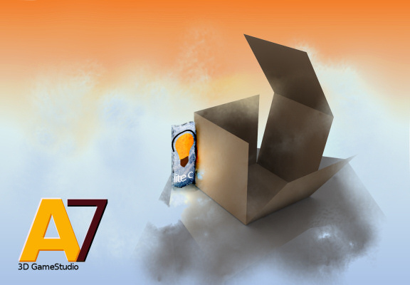
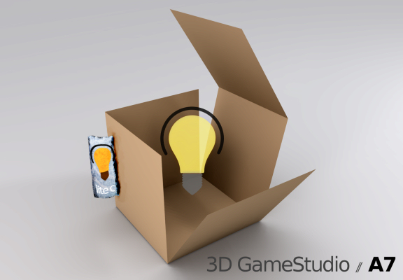
I think JCL don't want that we should make the A7 logo / Conitec logo / 3dgs logo. And we don't have to make a splash screen like in A6, because there it was shown after the engine startup screen. For eaxample here the Photoshop startup screen:
So now we should design a splash screen which is part of the startup screen. As you can see from the picture we only should design the upper part. But i think such things are a way too old, nowadays more and more companys have such startups:
@jcl: Is it allowed to use pictures with transparency such like the splash screen above (corel draw) ? PS: Normally the white thing above the blue line isn't shown.
@jcl: will the user be able to change the splash screen? (not necessary in my opinion)
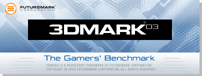
@jcl: Something like the splash screen of 3DMark would be the best for A7/GameStudio. It has a professional look, is easy to made and it fits perfect for any games made with GS. Plus, it has not soo much white in the splash screen.
@jcl: I think we don't need an additional black splash screen.
Posted By: Thomas
Re: A7 logo contest - 01/24/07 17:50
First Logo / Erster Versuch


Was sollen wir eigentlich machen ein Logo oder ein Splash
Gruss
Posted By: inFusion
Re: A7 logo contest - 01/24/07 17:50
This is another version. I changed the A7 a bit to make it look more "aggressive":

@jcl: are we allowed to include the light bulb like I did or does it have to be abstract? I think if the light bulb has to be abstract it would put a big limit on to the possibilities.
Posted By: broozar
Re: A7 logo contest - 01/24/07 17:52
Quote:
Was sollen wir eigentlich machen ein Logo oder ein Splash
beides
Posted By: Joey
Re: A7 logo contest - 01/24/07 17:53
allthough i cannot speak for jcl i'm sure you can use true color images in the screen. no need for abstraction. well, i would do it anyway. but try to not make it cut off so sharply at the image edges.
Posted By: HeelX
Re: A7 logo contest - 01/24/07 17:56
After posting my previous two comments, I started to design a real logo in the meaning of a corporate identity, like it has been done on the Conitec website and the box art of my A6 version. Here is what I have done:
Red logo on black ground

White version, everything all simplistic and bright:

This is a design for a dark red ground as it is the current design of A6:

A complete black and white version without the line:

Basing on the very first picture I liked to design icons in that style for the different applications GS contains. All GS versions didnt matched the engine or had'nt a superior design, so I did it for the apps as well:

I hope you like it!
Posted By: inFusion
Re: A7 logo contest - 01/24/07 18:04
I like in the last image the engine logo, it is a nice anagram for something that is literarily "working". Also the hole in the cogwheel also looks like a keyhole. Nice
Posted By: sinnlos
Re: A7 logo contest - 01/24/07 18:05
wow heelx, i like those!
They somehow got a little "apple"-ish feeling to it.
don't know why exactly, just a feeling... but i like it.
i hope it's no offense to you that i mentioned apple.
i'm pondering since days what logo/splashscreen i could do, but i haven't had any good idea.
cheers
sinnlos
Posted By: HeelX
Re: A7 logo contest - 01/24/07 18:10
thanks! I thought that the last icon could be the engine logo which is visible in the task manager, icon of the published EXE and/or upper left icon in window mode. But it could serve as well as A7 logo, right.
Posted By: broozar
Re: A7 logo contest - 01/24/07 18:22
i like it, though the "a7" needs a rework. maybe smaller and wider?
Posted By: Jog
Re: A7 logo contest - 01/24/07 18:32
Hallo
Hier mein bescheidener Beitrag
Logodark1

Logodark2

Logolite1

Posted By: Lord_Vader
Re: A7 logo contest - 01/24/07 18:38
Ich mache aus langerweile mal mit...(5h pain!
)
my A7-"ANTI-FX"-DARK-Logo:

my A7-"ANTI-FX"-LITE-Logo:

some old versions:

...ich hoffe meine Logos sind nicht zu firmen-like
Posted By: Joey
Re: A7 logo contest - 01/24/07 18:47
wow, heelx, damn good!
Posted By: broozar
Re: A7 logo contest - 01/24/07 19:49
sorry couldn't resist:
http://caffier.net/ (small animated version of my design)
Posted By: frazzle
Re: A7 logo contest - 01/24/07 20:06
It's a nice logo but I don't think the main reason was to make it look animated since the logo will be shown on the top of the screen unlike the existing logo that covers the entire screen all up so detail will not be necessairy in
the next logo
Cheers
Frazzle
ye si will vote for heelx last entry. THATS exactly what we need. simple and professional and the icons represent everything well.
it just might be a little bit better if it shows something in the mainlogo that it is a 3d gameengine.
Posted By: Joozey
Re: A7 logo contest - 01/24/07 20:40
I go for DaBro0zar's design, HeelX design looks too boring...
BUT we have around a MONTH to go yet
, so anything can happen.
Posted By: DARKLORD
Re: A7 logo contest - 01/24/07 21:30
HeelX design is what we need
It's simple but looks realy cool.
I like these little icons, they are very nice.
Posted By: sinnlos
Re: A7 logo contest - 01/24/07 21:31
here is my concept:
4:1 Splashscreen can be used for black and white background...
i have to admit, i didn't make any ideas on the logo... just used a font.
i could imagine dabrozar's or heelx's logo on that bulb.
cheers
sinnlos
Posted By: broozar
Re: A7 logo contest - 01/24/07 21:49
wow... cool... just remove that "conitec datasystems", or add a real shadow for the text, not such a "pixelglow".
Posted By: ventilator
Re: A7 logo contest - 01/24/07 22:12
looks nice but more like an osram advertisement!
Posted By: checkbutton
Re: A7 logo contest - 01/24/07 22:59
Well, so far I like HeelX's and DARKLORD's suggestions most.
i don't think we will get much feedback from jcl or any of the admins, because of the fact that they cannot reveal any favorites, being that they may be the judges, i really want to know, but we'll have to wait, we still have a while before this contest ends, i just wish to know which ones are applicable so far, but then again, that cannot be revealed until the time comes
Posted By: mpde
Re: A7 logo contest - 01/24/07 23:35
ein weiteres
dark

light

mpde
Posted By: JibbSmart
Re: A7 logo contest - 01/24/07 23:42
lol, this morning i was thinking of doing a dice design with lucky number 7
i havent started it yet, but i dont want to seem like im copying mpde. it wont be very similar.
every time i read this thread it seems to have 50% more replies to it!
julz
Posted By: Lord_Vader
Re: A7 logo contest - 01/25/07 00:23
Wenn A7 eine Firma w�re...
...hier mein verbessertes A7-"COMPANY"-Logo:

...noch eine kleine Korrektur:

...damit ist mein A7-"COMPANY"-Logo fast fertig, nur diese Gl�hbirne siehts zu sehr nach Adobe�-Photoshop� aus...
Posted By: Joozey
Re: A7 logo contest - 01/25/07 08:52
Lord_Vader I don't see any pictures.
Posted By: broozar
Re: A7 logo contest - 01/25/07 09:15
because the server does not exist (see site source)
Posted By: EX Citer
Re: A7 logo contest - 01/25/07 11:08
I like to see so many entries. That is realy cool
I hope it�s ok if I put my critics here. I mean maybe it helps the others, or you just can ignore it or correct me.
Many people have "voted" here for DarkLords entry, so I want to say why I wouldn�t like it as new A7 splash. It�s a very nice logo creation, but for a video game engine too boring for my taste.
About HeelX last entry which looks very good I have to critize that I see more a key hole in the logo as a light bulb. The other point is that�s it looks a little common. I feel like I have seen in other programs these teeth weels and circles and triangles in icons.
But two very well done entries.
Sinnlos entry is not bad but why do you write all the text in there? I thought it was stated that we should only use A7 and a light bulp. I mean of course you can use text as design element. But in this case you get problems what to place outside of the splashscreen. A white panel?
From the professional splashscreens here I like the corel draw splash the best. That makes me somehow breath very deep.
Ventilators last entry is again very interesting but difficult to fade(?) and maybe too fotorealistic. I mean it�s a game engine and not rino
JulzMighty entry is very interesting. Has something old fashioned what can be good or can be bad, I don�t know. Reminds me of these old steam machines.
DaBro0zar entry is very nice but I am not sure if I like the A7 font.
Realspawn entry looks good. Maybe he can play more with the idea or other ideas.
In Spikes entry the quality should be better. I mean I can see a little that it was made quickly because the font doesn�t look that well. The breaking glass looks beautyfull but I think the license for the foto will be a problem or did you made that foto yourself? And I have to agree. The Photoshop lensflare looks absolutely shitty because it�s always the same
I mean it�s a incredible complex form, but even if it is I can see that it is the same as always. That is sooo cheap
Firoballs friend: Nice but too childish for my taste. And I am no friend of a mirrored 7 when I can�t see the big idea behind it. I mean a real big and unique idea.
HeelX first entry, is nice but for some unknown reason many people in my class don�t like these display fonts. Espacially these grafity like. I think it�s because they were used too excessive in the last years while having a very excessive character. I mean Bodoni is many years old and still one of the best fonts, next to helvetica and CO. These fonts arent very impressive, but they do their job. For me Bodoni and Helvetica aren�t top notch because they are so much used everywhere. Too much perfection makes them inperfect
I hope that is useful. If not I can still delete this post
Posted By: Bot190
Re: A7 logo contest - 01/25/07 12:08
these are looing really good. i would enter but i dont have a place to host the pics... i don't want to use the free places but to bad for me... one thing... how are you getting the pics of the light bulbs?
My first temporary entries, cause there is no light bulb yet(and i dont know why we should add the name of the script lenguage in an engine-logo, but well...)
Light

Dark

Posted By: Joozey
Re: A7 logo contest - 01/25/07 13:15
Well this is what I do like
.
Simple, clean and nice looking.
Posted By: inFusion
Re: A7 logo contest - 01/25/07 13:50
I agree, that is looking very professional, nice
Posted By: Joey
Re: A7 logo contest - 01/25/07 13:57
well, i don't know wether conitec is following this contest as we all do, but...
why do you want to ruin your logo with a light bulb? i mean, there is a message in a light blub that i understand, but i'd bet very few who might see the logo at game start will ever realize what it stands for. also, it's not very fancy to add the name of a scripting language to the engine logo, as michael has already stated. maybe you should think that over?
Posted By: HeelX
Re: A7 logo contest - 01/25/07 14:44
I used in my very first entry (which I will overwork for the final version in some days) that type of times new roman font because I believe it is a very stylistic font - when you use it carefully. Especially apple uses it - and I like it.
I dont like the idea of those text combinations ("put the 7 and the A somehow together"), especially when the seven is left of the A ("7A?") and when the roof of the seven is forked out. "A7" is a very closed shape, similar to a parallelogram. The difficulty of the requirements is not the border fade or the coloring. Its the composition. Its very hard to make a logo slaved by a lightbulb. So: do you make a logo basing on the lightbulb and a slaved A7? A very massive A7 logo and a lightbulb somewhere you made 2 seconds ago - or do you find a balance?
Good luck to everyone and a friendly competition.
Thanks for all the support.
Cheers!
Christian
Posted By: PHeMoX
Re: A7 logo contest - 01/25/07 15:46
Guys this is supposed to be a contest with simple rules, I'd say be glad that we even get a chance to influence the type of logo. I think wether or not you want a stylish logo or not is entirely a matter of taste. There are plenty of examples of great logos who are not abstract at all, so that's not a real argument unless it's based upon your taste. (Psygnosis, Raven Software, Adobe Photoshop, Fishtank Interactive (to bad it's no more) just to name a few have great logos). A banner-like splash screen usually is a lot more graphic than a normal logo by the way, so it's moreso the otherway around if you ask me.
Cheers
Posted By: Lord_Vader
Re: A7 logo contest - 01/25/07 17:53
I hope my logos are visible now(page 11 and 13)

Posted By: Joey
Re: A7 logo contest - 01/25/07 18:04
11 and 13
, i only have 7 pages here. well i'm also very curious and it's indeed a great idea by a company to hold a contest like this.
Reworked, but still not final:


Posted By: Lord_Vader
Re: A7 logo contest - 01/25/07 18:56
...hatte mal wieder langeweile
:

[ist leider an einigen kleinen Stellen unsauber, aber dass kann man ja beheben
]
Posted By: FBL
Re: A7 logo contest - 01/25/07 20:00
Not what I wanted it to look like, but oh well...


Posted By: frazzle
Re: A7 logo contest - 01/25/07 20:33
@ Michael:
Nice concept but isn't it A7 instead of 7A
@ Lord_Vader:
Looks like it has got lot's of potential, it's quite simple and clean

@ Firoball:
I like the idea with the bulb between the A and the 7, creative concept
I rethought my concept and came out with the following idea:
"black"

"white"

Cheers
Frazzle
Posted By: Germanunkol
Re: A7 logo contest - 01/25/07 20:46
xD...
your C has a beard
sorry...
I really like the last two entries. Just, I don't know if strangers in the 3dgs community would understand the "beard"...
But they look good
Micha
Posted By: Joozey
Re: A7 logo contest - 01/25/07 21:05
It's Canta Clause ;p
... nvm
Posted By: Lord_Vader
Re: A7 logo contest - 01/25/07 21:46
...hab ganz sch�n viel langeweile:

[ist leider wieder etwas unsauber
]
...ich glaub Orange-Schwarz-Wei� setzt sich durch
Quote:
@ Michael:
Nice concept but isn't it A7 instead of 7A
so what? o_O
Posted By: Inestical
Re: A7 logo contest - 01/26/07 01:17
a7 entry, box 250x250, .gif format ensures 256 colors (8bit)
white

black/invert

Posted By: rojart
Re: A7 logo contest - 01/26/07 05:25
My another idea.


Resized Version in progress.
Posted By: mpde
Re: A7 logo contest - 01/26/07 08:48
logo dark

splash dark

logo light

splash light

mpde
ps: die anderen sind gel�scht...
Posted By: Inestical
Re: A7 logo contest - 01/26/07 09:02
Latest version, couldn't update earlier:
white

black/inverted

Posted By: HeelX
Re: A7 logo contest - 01/26/07 12:54
Inestical, that (orange) 7 after "Acknex" is great! What font has been used by you?
Posted By: Inestical
Re: A7 logo contest - 01/26/07 13:10
lemme see...
I took the 7 out of 'a' in font of Cursor
then I made it bit longer so it'd look more like 7
Posted By: Zapan@work
Re: A7 logo contest - 01/26/07 13:51
Posted By: vlau
Re: A7 logo contest - 01/26/07 13:59
Here is my first try :


zapans picture is really good too, though you should change the red color. it looks so much like adobe photoshop.
Posted By: Joey
Re: A7 logo contest - 01/26/07 14:57
zapan's entry is my favourite now
, you rule!
nice ripoff @ zapan
Posted By: Inestical
Re: A7 logo contest - 01/26/07 15:42
dimensions:
4:1 or 5:1 banner sized max 480pixels in width
200x200 to 250x250 cube/box logo
so.. what's wrong in few of these entries
Quote:


these are the only other entries i like, i really like these, however they have to be a small image, if they are square make them either 200x200 or 250x250 , i've been beaten
Posted By: Inestical
Re: A7 logo contest - 01/26/07 16:20
Last version, this is da one I will ever change.
white

black/invert

Posted By: Alex J.
Re: A7 logo contest - 01/26/07 16:38
hey zapan das ja fast das selbe was ich damals f�r a6 gemacht habe
und der michael hats erkannt XD
Posted By: Lord_Vader
Re: A7 logo contest - 01/26/07 17:16
gegen das von zapan komm ich nur schwer an, mein letzter Trumpf, die finale Version meines Logos:

und hier eine alternative Version:

hier nochmal die schlichte Variante:

aber da noch eine menge Zeit ist, bevor sich der Contest seinem Ende n�hert, fang ich mit einer neuen Idee von vorn an
<edit>
...da meine letzten Logos leider sehr unsauber sind,
-> am Besten weiter weg vom Monitor als sonst
</edit>
Posted By: frazzle
Re: A7 logo contest - 01/26/07 19:34
Posted By: Joozey
Re: A7 logo contest - 01/26/07 20:55
Quote:
It's a nice 3D logo but I think it has got the look of the existing A5 logo
Well A5 looks like A4, so why shouldn't A7 (and actually A6 as well) look like them as well. I think it's a nice standard for the engine.
Posted By: frazzle
Re: A7 logo contest - 01/26/07 22:02
Quote:
Quote:
It's a nice 3D logo but I think it has got the look of the existing A5 logo
Well A5 looks like A4, so why shouldn't A7 (and actually A6 as well) look like them as well. I think it's a nice standard for the engine.
That's true, the standard is indeed very nice but after 3 engine's the logo's may look like "the baby of the A6 logo". In the language of the poems I mean by this, something new and fresh which looks like it has got a potential professional expression
Maybe a complex explanation but that's my thought about it.
Cheers
Frazzle
Posted By: Scorpion
Re: A7 logo contest - 01/26/07 22:02
your logos are really great
Zapan@work, i like them a lot.
But i wouldn't just invert the color of the black logo...
why doesnt anyone get that zapan ripped them off from Alex_Jackers' work?
Posted By: rvL_eXile
Re: A7 logo contest - 01/26/07 23:57
Ich habe auch mal ein kleines "Logo" gemacht...
LIGHT VERSION:

DARK VERSION:

Posted By: HeelX
Re: A7 logo contest - 01/27/07 00:43
@Angel: die Birne auf deinem black Motiv find ich irgendwie toll: irgendwie s�� - so klein.. und soviel Licht
I've got in my livingroom a poster from the GDC 2004 and they used for their leitmotif hexagon shapes. This is pretty nasty, cause they are flatened cubes
MUAHAH so this bothered me for the last few days. In combination with my original bulb design and some crits about it, I came across to make these two design studies, this time in a banner format (yay!).


The second one looks more 3D and is much more fluent vor the viewer. I like both of these, but especially the second. Maybe my mind its apple'ized, the design is very lightweight, I guess.
I hope you like it, enjoy!
meh! - Christian
[EDIT]
In the case you DONT like that gameengine suffix, just hold the hand over it on your screen.. it looks very well without it (results in a square format logo) with or without the vertical line. Though, I like that "gameengine" suffix very much, because, well, its a gameengine and not, well an orange juice maker or something
Amazon for example shows on the bottom on their search results page a "A9" logo, OMG A9... ^^ well, nobody knows what A9 means and I propose to leave it in the banner/logo for a better understanding.
Posted By: achaziel
Re: A7 logo contest - 01/27/07 00:45
well, i dare to make some logos too. let's see how it works^^
here's the logo "lite"...

and here's the "dark" one...

hope you enjoy it^^
Posted By: rvL_eXile
Re: A7 logo contest - 01/27/07 00:57
Rofl... Lass meine amre Gl�hbrine in Ruhe die hat auch Gef�hle ^^
Habe lange genug gebraucht um die in C4D hinzubekommen xD
cYa Angel
Posted By: TWO
Re: A7 logo contest - 01/27/07 09:13
ZapanATwork�s splashscreen with the icons from HeelX are my favourites
Posted By: Ayrus
Re: A7 logo contest - 01/27/07 10:27
I like Zapan's best myself because they are of a simple design and follow in the footsteps of the older logos, giving them a facelift, bringing them up to the current times.
Also, the lightbulb is present, but not intrusive. Personally, IMO (And trust me, conitec probably has a marketing division that knows a ton more than myself), featuring lite-C in the logo is kind of detracting in a lot of cases. I find (In a lot of these logos, even though well done) that the Lite-C advertisement is too pronounced, pulling the attention away from the actual product.
Regards,
Ayrus
Posted By: mpde
Re: A7 logo contest - 01/27/07 11:02
logo dark

splash dark

logo light

splash light

mpde
Posted By: HPW
Re: A7 logo contest - 01/27/07 12:46
Here are my tries...
A7 Logo 1 light

A7 Logo 1 dark

Posted By: HeelX
Re: A7 logo contest - 01/27/07 14:11
where is the bulb? do you need the outline of the seven? I guess a smooth shadows works as well.
No offense, but I think you should polish your logo again. Its just a rectangle and two fonts, this is notvery outstanding.
Posted By: Xarthor
Re: A7 logo contest - 01/27/07 14:33
Ok in my next attempt is no bulb, no "Lite-C" just pure "Acknex 7":
Dark:

Light:

@heelx: that one is actually a ironic reply to the complains that my logo look smore like 7A than A7. Its no real contribution. ANd anyway, ill refuse to set up any ligt bulb into my logos, its just the most stupid thing ive ever seen that has to be in a logo... why the heck do we have to announce what scripting languge we used to the end user??? he wont even understand what the f*ck it is...
@thunder: nice ripoff from me lol xD
Posted By: inFusion
Re: A7 logo contest - 01/27/07 16:12
Stop complaining about rippoffs. Everyone can see for themselves what is a rippoff and what not if they read the thread completely. Complaining about others ripping of your work all the time just makes you look childish.
but i am a child!!!!!1111oneoneoneeleven
Posted By: rvL_eXile
Re: A7 logo contest - 01/27/07 17:02
A7 Light noch in Arbeit

Posted By: frazzle
Re: A7 logo contest - 01/27/07 18:10
Little update:


Cheers
Frazzle
Posted By: achaziel
Re: A7 logo contest - 01/27/07 18:24
deine gl�hbirne? seltsam, die hab ich n�mlich gestern in med gemacht...
Posted By: rvL_eXile
Re: A7 logo contest - 01/27/07 18:34
ja f�r die habe ich schon Patent beantragt xD
Aber meine is na nur mit C4D gemacht xD
Posted By: achaziel
Re: A7 logo contest - 01/27/07 18:35
patent... XD
Posted By: Lord_Vader
Re: A7 logo contest - 01/27/07 18:59
Posted By: frazzle
Re: A7 logo contest - 01/27/07 22:08
Here are some potential idea's I've drawn on a paper, logo 3 is the logo I already posted in my previous post. Mind that those are early concepts and that they can be adapted when needed. It's not my intention of making them all, this will be chosen later on:


Cheers
Frazzle
Posted By: inFusion
Re: A7 logo contest - 01/28/07 11:11
"Logo ' s" ... arrr.... Please remove that ' between Logo and s, it is hurting my eyes
Posted By: rvL_eXile
Re: A7 logo contest - 01/28/07 12:47
No, i think there good Concepts... I Like the second one
cYa Angel
Posted By: EX Citer
Re: A7 logo contest - 01/28/07 17:59
HeelX, in your last entry game engine is wrong ...(?) "gesperrt". The spaces between the letters in the words are bigger as the spaces between the two words, even more tricky: game ends with 'e' and engine starts with 'e' so you have to make a espacially big space between the two words. The way it is now it looks very strange. The 'e e' is very dominating. And I am not sure if the emboss(relief) is useful. Nice design. Very good as your others. The box on the left reminds me a little of a toybox. Maybe you can expand that idea - that many game related stuff spreads out of the box in simple symbols or something like that (items, weapons, vehicles, cute big breasted girls, hearts, swords, ammo boxes, shields, spaceships, dragons etc.). You know these boxes, which play a music and suddenly pop up and something toylike jumps out?
MAybe that stuff could fly like the material in a "milch stra�e", less like a fontain. Than it�s more magical. I mean if the stuff comes out of the box and then flies from left to the right on the higher free space in that layout.
Mpde entry is interesting. But the font should be more unique. Looks to me like a common cartoon font and that makes it look a little cheap.
Micheal Schwarz entry looks beautyful just because it is ... "gesperrt" very well. Not bad. The Acknex is really written very well. Did you do the spacing youself?
Thunders entry is a good idea but I think ACKNEX written in capitals looks better as Acknex. But maybe this is just because Michael Schwarz ACKNEX looks so good
Indeed frazzles second scribble has potential. But I am worried about the huge lightbulb in that design because a light bulb is bright and so its dominating as you can see very well in Angels design. IF you make it that big, it could steal the show and every more design would drop under the table.
here my idea:

Posted By: Endgegner
Re: A7 logo contest - 01/28/07 19:47
The cube looks cool, but the A7 and lite-C don't fit at all..
Man, with all those great submissions I don't think I want to participate anymore
. HeelX's designs rock...
Posted By: broozar
Re: A7 logo contest - 01/28/07 20:00
for all of you who didn't like my font, i made a slightly new one, here the light version:

the image follows the same guide lines as my previous one and features all the previous advantages as well.
Posted By: HeelX
Re: A7 logo contest - 01/28/07 20:06
Quote:
The box on the left reminds me a little of a toybox. Maybe you can expand that idea - that many game related stuff spreads out of the box in simple symbols or something like that ((...), cute big breasted girls(...)
Very nice idea, I should call my all female friends if they like to inspirate me "why should I pose naked here?" "you are cute.. and stuff; well, its for a logo design." "logo design? are you kidding me?" "c'mon, keep quite, do me a favor and we are all fine. Relax." "okay, honey" - you made my day!
Well, your comment was really helpful, thank you. Uhm, I wrote it as "gameengine".. I will do another one with seperated words.
The box: I didnt wanted to continue on the primary cube design, so this should be a small sidelement. I will see: I planned to submit one or two more entries before the contest ends, maybe I hook on this for a try. Thanks for your support!
Cheers
Christian
[EDIT]
@DaBro0zar:
No offense: This font makes it worser as it could be! the shape of the bulb-head is very sloping, so, if you put another sloping element inside it, it should be at least parallel or orthogonal to the picture axis. If you pose it with other slope angles, it looks very disturbing. Remove/replace the fade of the bulb somehow. This looks very photoshopped and very obvious. The material design looks very good, looks appl'ish. Good.
Posted By: broozar
Re: A7 logo contest - 01/28/07 20:20
@heelX: all in the picture is rendered in C4D... do you like the font? i know the bulb isn't well done, but is the font better than the old one?
Posted By: frazzle
Re: A7 logo contest - 01/28/07 20:21
I actually like this concept of DaBro0zar, it's very clean and yet it looks like a very pro logo but I miss the liteC element in it like JCL mentioned, also the A and the 7 are hard to recognise from eachother.
But besides that, nice design
Cheers
Frazzle
here an update from my idea:

Posted By: HeelX
Re: A7 logo contest - 01/28/07 21:33
@DaBro0zar: Yes, its better now. But why does that one part of the bulb fade?
Posted By: broozar
Re: A7 logo contest - 01/28/07 21:48
@ heelX: because i wanted it to fade, i applied a double-fading alpha channel to the torus-like object. ok, i still have to think about it.
@all: just for fun! ever wondered how a 7-sliced light bulb looks, recorded with a a 2� lens? like an insect!

Posted By: FBL
Re: A7 logo contest - 01/28/07 21:51
looks like one of those alien suits of 5th element
I wonder how many logo designs went wrong and were not posted here. We should make a seperate thread and post our crap, so we'd have something to laugh
Posted By: HeelX
Re: A7 logo contest - 01/28/07 22:29
We could introduce every month a community logo/splashscreen contest. One month as most retro as you can, the next time the most psychodelic logo, then with at least 7 bulbs and thirty cubes ^^ haha I would like it. The requirements should be set by some crazy persons here.. sarcastic/ironic ideas? We all know some people here which are designated for this ^^
Posted By: Shinobi
Re: A7 logo contest - 01/28/07 23:13
I am late as always , saw this threat just now and i will make one logo as well as soon as i can.
Posted By: rvL_eXile
Re: A7 logo contest - 01/29/07 10:28
Ganz ehrlich Michael?
Deine vorherigen entrys waren besser...
cYa Angel
aber es regen sich alle auf das da 7A anstatt von A7 steht
Posted By: Joey
Re: A7 logo contest - 01/29/07 11:58
find nich, find den neuen besser. die farbgebung ist auch sch�n modern und doch solide, gef�llt mir. allerdings hat die ja schonmal jemand benutzt (guck jetzt nicht nach), es scheint als passe die einfach zu a7
ja das is auch nicht schlecht, jedoch ist die 7 viel zu undeutlich *am CRT hier sitzt*
Posted By: HeelX
Re: A7 logo contest - 01/29/07 12:06
Quote:
find nich, find den neuen besser. die farbgebung ist auch sch�n modern und doch solide, gef�llt mir. allerdings hat die ja schonmal jemand benutzt (guck jetzt nicht nach), es scheint als passe die einfach zu a7
*r�usper*, *Anwalt anruf*
... das ist jetzt ja schon zuu offensichtlich ^^
ich wollte noch "inspired by heelx" drunetrsetzen, aber so sp�t nachts misf�llt das irgendwie
Posted By: broozar
Re: A7 logo contest - 01/29/07 13:51
better now o.0 ?

on my damnit CRT it always looks the same, though i know from my home pc with the LCD monitor that its different, so i will tell you what i think when i get home
Posted By: mpde
Re: A7 logo contest - 01/29/07 18:17
logo dark

splash dark

logo light

splash light

mpde
Posted By: Jog
Re: A7 logo contest - 01/29/07 18:24
Hallo
Hier mein bescheidener Beitrag
Logodark1

Logodark2

Logolite1

Posted By: mk_1
Re: A7 logo contest - 01/29/07 19:51
by Michael Schwarz

nice coloring and very simple. That's what I've always wanted
Posted By: Shinobi
Re: A7 logo contest - 01/29/07 23:39
2 attempts by me .... they are dark versions , can be changed to lighter versions of course.


Posted By: Why_Do_I_Die
Re: A7 logo contest - 01/30/07 03:05
Wow , these are all very good , I personally like zappan's idea best too. It looks very professional , has the full feel of a professional software logo.
Posted By: Shinobi
Re: A7 logo contest - 01/30/07 04:11
Posted By: vlau
Re: A7 logo contest - 01/30/07 15:10
Posted By: Damocles
Re: A7 logo contest - 01/30/07 15:15
I am not an Artist, so this is just an Idea:

simple Black-White look
Posted By: Germanunkol
Re: A7 logo contest - 01/30/07 15:42
Shinobi, I like your last ones...
Posted By: aztec
Re: A7 logo contest - 01/30/07 15:55
Quote:
Shinobi, I like your last ones...
Got to agree they look very good
Posted By: HeelX
Re: A7 logo contest - 01/30/07 16:02
offtopic:
I had a Geistesblitz! .. one minute before the thread is closed someone pulls out the crappy A4 cube, changes it to A7, let it spark 3 times more fire, reduces the color dramatically on 8 colors and place beside the cube a worse edited, cutted out of a magazine and scanned lightbulb..
....and wins.. OMG horror, here he comes, I wanna die
ontopic:
does someone like to do a pixelart entry? I would love it!
Posted By: Shinobi
Re: A7 logo contest - 01/30/07 19:04
Posted By: frazzle
Re: A7 logo contest - 01/30/07 19:50
I can't say it's a bad logo but where's the A7 element Shinobi
??
Cheers
Frazzle
Posted By: Shinobi
Re: A7 logo contest - 01/30/07 19:57
I read more from the beginning of the contest now and just want to say all my works can be converted to any size , width , alpha and fading better to black or white. I just show some of the ideas and the rest like exact format or banner size or fewer effects or whatever , can be adapted to the needs later on.
@frazzle saw your replay before i submited my replay
, sorry i read the beginnig stuff just now , and as mentioned above all can be changed if needed , just wanted to show my ideas and styles the rest can be adapted.
Posted By: frazzle
Re: A7 logo contest - 01/30/07 20:07
Quote:
I read more from the beginning of the contest now and just want to say all my works can be converted to any size , width , alpha and fading better to black or white. I just show some of the ideas and the rest like exact format or banner size or fewer effects or whatever , can be adapted to the needs later on.
@frazzle saw your replay before i submited my replay , sorry i read the beginnig stuff just now , and as mentioned above all can be changed if needed , just wanted to show my ideas and styles the rest can be adapted.
Oke np, your creativity as can be seen in your logos is as usual top of
the art !!
Cheers
Frazzle
Posted By: EX Citer
Re: A7 logo contest - 01/30/07 20:47
Well, a few weeks ago I thought about making a pixel game with 3DGS.
I think the pixel logo will fail because it fits much better to a 2D engine instead of a 3D/2D engine.
Posted By: frazzle
Re: A7 logo contest - 01/30/07 21:12
New updates, related to my possible designs I've posted earlier:


Cheers
Frazzle
Posted By: Loopix
Re: A7 logo contest - 01/30/07 22:00
Orange rules
Posted By: Shinobi
Re: A7 logo contest - 01/30/07 22:14
Quote:
Oke np, your creativity as can be seen in your logos is as usual top of
the art !!
Cheers
Frazzle
Thanks
Your Orange little Logos looking nice as well Frazzle
Posted By: LWD
Re: A7 logo contest - 01/30/07 23:22
Just one question, for win the A7 Pro the winner need to have a another version of 3D Game Studio?
Thanks!
Posted By: Damarus
Re: A7 logo contest - 01/31/07 00:01
i think it doesnt matter which version you have it can be standart extra com or pro.(at least i think so).
cheers
Damarus
Posted By: LWD
Re: A7 logo contest - 01/31/07 00:23
The problem is that i dont have the 3D Game Studio, i use the Trial version
If i Win the contest i will win the a7 PRO?
Thanks!
Posted By: Damarus
Re: A7 logo contest - 01/31/07 00:33
im not sure if u get the A7 pro with a trial version but in case u should win u should have at least standart version but ask someone who knows the answer for sure.
cheers
Damarus
Posted By: ventilator
Re: A7 logo contest - 01/31/07 01:19
could someone post the a4 and a5 splash screens?
i can't remember them...
Posted By: William
Re: A7 logo contest - 01/31/07 02:24
Posted By: HeelX
Re: A7 logo contest - 01/31/07 06:05
Quote:
could someone post the a4 and a5 splash screens? i can't remember them...
Eye-cancer is a really bad thing, Thomas, but if you deserve it, ... later after I have vanished all that little deamon around my head in form of cubes ^^
Posted By: beegee
Re: A7 logo contest - 01/31/07 12:10
@william: They are great, but i find the font of the a7 text doesn't fit to the banner. Well, i find the first is the best (white) and the second ( dark ) .
Posted By: Joey
Re: A7 logo contest - 01/31/07 15:52
@william: mit dem rest, ohne das a7 und ohne den hintergrund k�nntest du einen sehr guten splashscreen machen... ver�nder' die beiden dinge und halt' dich mehr an den vektorstil von den linien unten und dem zeugs um das "c".
Posted By: FBL
Re: A7 logo contest - 01/31/07 18:26
Quote:
could someone post the a4 and a5 splash screens? i can't remember them...


Don't have light/dark logos of A4 anymore, but they're basically the same as A5, only showing a 4.
Posted By: frazzle
Re: A7 logo contest - 01/31/07 19:34
Posted By: HeelX
Re: A7 logo contest - 01/31/07 22:14
Orange was the mainstream color of last summer, but I heared that light blue and light yellow - in combination! - will be the hit this years summer.. hmm.. sounds freaky!
Nevertheless, another entry by me:

Its a more artistic interpretation of the bulb, in the fashion of all the 3D programs like lightwave, 3dsmax and so on. There is a little arrow element in the bulb-mount which represents progress.. or should. The frame and the somehow neutral A7 is the opposite, more technical part of the whole, which bounds everything together.
I repeated it in several schemes like you have already seen before: the typical white on black scheme, the wine-red and more contrastive version in the manner of the current design and the white on white version, which is really lightweight.
I hope you like it,
enjoy and have a good night!
Cheers,
Christian
Posted By: broozar
Re: A7 logo contest - 01/31/07 22:26
seriosly, i love it! but i could imagine it would look a bit better if it'd be a lil smoother... less angular.
Posted By: HeelX
Re: A7 logo contest - 01/31/07 22:33
You've got now another beer for free for your kind words. Hm I guess they are two now (remember that kart?). I will do it for you - tomorrow. And I will add my previous logo (that hexagon) with another font approach.
Good night,
Christian
Posted By: Shinobi
Re: A7 logo contest - 01/31/07 23:08
Posted By: Damarus
Re: A7 logo contest - 02/01/07 01:09
here are some logos and banners i made.
first possible logo Dark

first possible logo Light

second possible logo Dark

second possible logo Light

third possible logo Dark

third possible logo Light

Fourth possible logo Dark

Fourth possible logo Light

lol i know there quite a few logos here but thats not the end
Banner 1 Dark

Banner 1 Light

Banner 2 Dark

Banner 2 Light

Banner 3 Dark

Banner 3 Light

Banner 4 Dark (you may not notice it but the earth is coloured in this banner)

Banner 4 Light

only one more banners to come
but thats all for now then
Banner 5 Dark

Banner 5 Light (the last one)

thats all i have to post hope u like it.
cheers
Damarus
Posted By: broozar
Re: A7 logo contest - 02/01/07 09:48
Posted By: rvL_eXile
Re: A7 logo contest - 02/01/07 09:50
lol...
Also deine ersten Entry fande ich bis jetzt am besten, w�rde mich nicht wundern wenn du gewinnen solltest...
cYa Sebastian
Posted By: Germanunkol
Re: A7 logo contest - 02/01/07 12:13
Damarus, I really like the idea with the planet thing.. looking great!
i just don't like the color of the A7 on the dark version that much, but that's just my oppinion. great work!
Micha
Posted By: PHeMoX
Re: A7 logo contest - 02/01/07 12:32
I like the black and white top left one a lot, but the other ones with colors look bad. Somehow those kind of logos need to be in just two colors.
As for Damarus' logos, I like the Banner 3 dark and light versions. I don't really like the logos (except Fourth possible logo light), especially not the darker ones. The blue color should be smoother, not with a grid,
There are a LOT of entries now by the way, some very good ones too,
Cheers
Posted By: Towelie
Re: A7 logo contest - 02/01/07 12:37
BaBroozar: That made me laugh
Posted By: vlau
Re: A7 logo contest - 02/01/07 14:20
Here are my black and white banner :


Posted By: inFusion
Re: A7 logo contest - 02/01/07 15:45
Quote:

Lol..
Posted By: Damarus
Re: A7 logo contest - 02/01/07 16:19
thx all for your nice comments i probably gonna change some logos and banners and post them again.
@PHeMoX what i meant with the grid is that you can create a whole new world so the grid means that you can create earth like model and because one half of the earth is without grid and the other is with grid it should represent the power of A7 on what you can create with the new engine. And in my opinion it wouldnt look good with a smooth grid. But that are just my thoughts.
Posted By: HeelX
Re: A7 logo contest - 02/01/07 18:18
Damarus, please dont post one version 12 times or so. Its pretty.. much. Even if you reshaped it.. well, I'm sure you know what I mean. Consider 4 really good versions the next time and we are all fine
one thing, though: Please overwork your globe.. its pretty blurry and stretched on all pictures.. please use a highres texture the next time and please, please, please remove that glow of the text. In this case, it is totally out of place.
(this was no offense)
Cheers,
Christian
Posted By: Damarus
Re: A7 logo contest - 02/01/07 18:27
yeah i know i posted quite a lot logos and banners
but i thought since you can post as much logos as u like im gonna post all logos i have
sry if i posted too many im gonna take 2 logos and 2 banners (the one that look best) and redo them. And thx for your advice i appreciate it.
cheers
Damarus
Posted By: EX Citer
Re: A7 logo contest - 02/01/07 18:31
Posted By: HeelX
Re: A7 logo contest - 02/01/07 19:53
Its a keyhole
well, its obvious that they have stolen my idea ^^ I swear I didnt even know about that.
Posted By: SFMAT4
Re: A7 logo contest - 02/01/07 22:13
an realy early offer from me

Posted By: Damarus
Re: A7 logo contest - 02/02/07 01:33
Here are the updated version of my logo and banner.
Banner 1 Dark

Banner 1 Light

Logo 1 Dark

Logo 1 Light

cheers
Damarus
Posted By: HeelX
Re: A7 logo contest - 02/02/07 10:51
This is just an update as it has been previously requested:
My last entry, but with a not-so-sharp trademark logo. I did it on both images a bit more, a bit less:

There were some complains about the font and arrangement of my previous entry, so I digged around and changed it. Also, the materials got a slight touch as well:

I hope you don't mind that I used the same font for "A7" as in my last entry, I like it.
This is a new variation of my last entry. Its blue, dark, a touch of mystery and somehow appealing. The reason why I post this, is because it is a result from an error while I rendered it. Meh!

Posted By: Germanunkol
Re: A7 logo contest - 02/02/07 13:36
en"gine"... did you mean to make the "gine" bold?
these are all great...
Damarus, great update!
Micha
Posted By: HeelX
Re: A7 logo contest - 02/02/07 14:51
Quote:
en"gine"... did you mean to make the "gine" bold?
Uhm, no.. I did'nt noticed that. I will check this out..
Posted By: TripleX
Re: A7 logo contest - 02/02/07 15:10
http://img508.imageshack.us/img508/255/hexwhitenewfontarrangemwl5.jpgwonderful Logo.. my favorite at the moment
2nd = Wetain
3rd = SFMAT4 Logo
Profesional is a simple but good looking logo..
My second idea:


Posted By: TWO
Re: A7 logo contest - 02/02/07 20:12
@Germanunkol
No this just looks more bold because of the light
Heelx you are a great artist!
Posted By: sinnlos
Re: A7 logo contest - 02/02/07 22:56
another try:
white version:
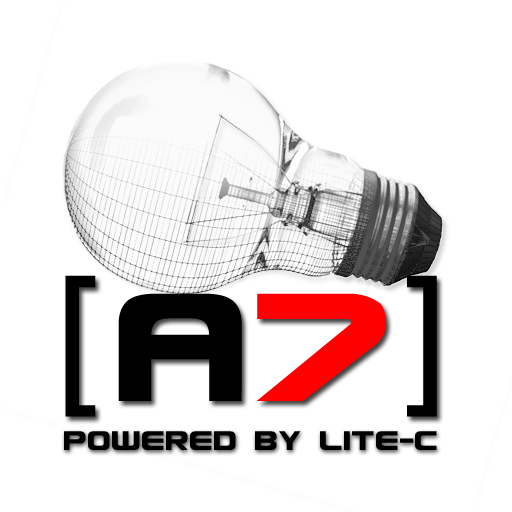
black version:
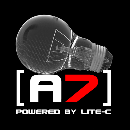
cheers
sinnlos
Posted By: Endgegner
Re: A7 logo contest - 02/03/07 00:03
Well, I was thinking about something like this, but that's far from a final version. I'm not too content with the light bulb though. Font is ok I think, but the 3D effect ain't good either ^^"

Here's a version without 3D effect...

As I said, I don't dig that very much myself ^^
Posted By: Shinobi
Re: A7 logo contest - 02/03/07 00:31
Everyone did a great Job on creating logos.
A new one by me , light and dark version.


Posted By: Thomas
Re: A7 logo contest - 02/03/07 12:30
N�chster Versuch

Posted By: SFMAT4
Re: A7 logo contest - 02/03/07 18:20
here the white version of my second logo


Posted By: TripleX
Re: A7 logo contest - 02/03/07 22:00
I love the second one of SFMAT4... Wonderful =) Maybe a bit more contrast at the lower part of the ice-cubes..
Remindes me a bit to the blender-logo (positive meaning):
http://www.dreaminmaniax.de/blender/splash_head.png
Posted By: TWO
Re: A7 logo contest - 02/03/07 22:44
Indeed a very nice logo AND the cubes are lit by an invisible lightblub
Posted By: HeelX
Re: A7 logo contest - 02/03/07 22:48
Why are there icecubes?
Posted By: Damarus
Re: A7 logo contest - 02/03/07 22:50
here a new logo i made.
Logo Light

Logo Dark

cheers
Damarus
Posted By: TWO
Re: A7 logo contest - 02/03/07 22:51
C-Lite is so hot that it melts the north and south pools... and they look good
Posted By: Damarus
Re: A7 logo contest - 02/03/07 23:01
Quote:
C-Lite is so hot that it melts the north and south pools...
well im not quite sure what you mean by that but thx for your comment!
Posted By: broozar
Re: A7 logo contest - 02/04/07 00:07
another one from me... guess what, the "c" in the bulb stands for lite-c.

i know it's not fading yet.
Posted By: SFMAT4
Re: A7 logo contest - 02/04/07 00:53
Quote:
Why are there icecubes?
Maybe an hot angine wich need cooling?
Posted By: Shinobi
Re: A7 logo contest - 02/04/07 01:29
Its only a Light version can be changed of course.

well it's nice to know my entry has no chance now
Posted By: Germanunkol
Re: A7 logo contest - 02/04/07 06:57
dabroozar, that's very cool!
Just still reminds me of biting into an apple...:)
But I like it
Posted By: EX Citer
Re: A7 logo contest - 02/04/07 09:31
Agree with heelX, what have icecubes to do with 3DGS? And secondly, we make a splashscreen for an game engine, not a 3D render engine. It doesnt matter if the image of SFMAT looks good or not if it doesnt fit. Look at the photopaint splashscreens. They are never 3D renders.
They are usually done with the software itself to show the possibilities of the software at startup.
For blender the screen is done with blender for photopaint its done with photopaint. That of course means that you can make an image in photoshop and render it in the engine because thats the common way to work with the engine. But showing an image rendered in a 3D render software which has nothing to do with the game engine is not the big deal...
And illustration is also okay because that�s common too. But using a super good 3D render is bad because users of other engines feel jackassed, because it�s like faking the power of the 3D engine. It�s what they did for PS3. Showing prerendered super beautyful 3D movies and telling the user that will be the realtime graphics when the game comes out. Well in the end the games didn�t looked like the prerender. They looked like games in all points.
Look, if every game engine would make a super beautyful prerender of a "game scene" users would think, hey that�s a powerful gameengine I have to buy. But that is a fake, and as soon as you find out that it hasn�t the power you are very pissed of. Even if it is more or less obviously that it isn�t rendered ingame, people will feel jackassed, because they think, the creators of the engine tried to fake the powers but where bad at faking it.
Posted By: SFMAT4
Re: A7 logo contest - 02/04/07 10:05
Quote:
Agree with heelX, what have icecubes to do with 3DGS? And secondly, we make a splashscreen for an game engine, not a 3D render engine. It doesnt matter if the image of SFMAT looks good or not if it doesnt fit. Look at the photopaint splashscreens. They are never 3D renders.
They are usually done with the software itself to show the possibilities of the software at startup.
For blender the screen is done with blender for photopaint its done with photopaint. That of course means that you can make an image in photoshop and render it in the engine because thats the common way to work with the engine. But showing an image rendered in a 3D render software which has nothing to do with the game engine is not the big deal...
And illustration is also okay because that�s common too. But using a super good 3D render is bad because users of other engines feel jackassed, because it�s like faking the power of the 3D engine. It�s what they did for PS3. Showing prerendered super beautyful 3D movies and telling the user that will be the realtime graphics when the game comes out. Well in the end the games didn�t looked like the prerender. They looked like games in all points.
Look, if every game engine would make a super beautyful prerender of a "game scene" users would think, hey that�s a powerful gameengine I have to buy. But that is a fake, and as soon as you find out that it hasn�t the power you are very pissed of. Even if it is more or less obviously that it isn�t rendered ingame, people will feel jackassed, because they think, the creators of the engine tried to fake the powers but where bad at faking it.
in my opinion these issnt right what you are saying.
Please look at the last acknex splash scenes or at a few other engine pictures.
Look at the Unreal Ed Splash Screen or the 3dsMax 6/7/8 screens.
btw: The most of the logo suggestion here are made with Render or 2D Tools wich have nothing todo with 3D gamestudio.
Quote:
Look at the photopaint splashscreens. They are never 3D renders.
Photopaint is a 2D Tool we are talking about 3D Software.
Firstly there is a need for a 3D look in the splash screen. If you look in the past of acknex there are (render!) cubes in the splashes so I implement cubes.
And nobody think these splash image is an realtime Screenshot. Its to abstract for a engine example.
At last sorry for my ugly english.
Best regards
SF
Posted By: HeelX
Re: A7 logo contest - 02/04/07 10:49
I think both of you are right in different ways. Exciter is right when he says a logo has a doubtful meaning when it is enriched in a wrong way. Though, the logo *could* be simply handsome and appealing (which targets more into sfmat's direction).
One thing on my checklist for general design and especially for logo design is the authentic factor. Thats because my first two entries suck (hey, its me who is telling so
) - I really like the cogwheel arrangment (especially the glass version) - but it is not authentic enough as a logo itself and for package design, splashscreen or print. Its a nice idea and worth a picture - but look: I tried to designed my subsequent entries to be authentic for a 3D engine and as well for ads, print and package design. Even if all my entries (and some others here as well) are rejected, I believe that they would made it as trademark and brand recognition. Icecubes are not recognizable. They are beautiful, thats all. As an art piece, I like your picture, but in these terms, it really doesnt fit, sorry.
Posted By: SFMAT4
Re: A7 logo contest - 02/04/07 11:27
Hello, and thank you for your answer HeelX,
I have seperated the Logo and the splash. Therefore 2 images. The electric bulb (Logo) is without ice-cubes. The cubes are second-ranked in my opinion. The logo on its own, the electric blub, should work.
The idea with the ice-cubes is from Timo. First I though that this is nonsense to but after a short time I liked and designed it.
An important point is:
the most editor-splashscreens are using wireframes of their artworks and so on. Everything nice, but I've seen it over 100x times. Thats why I like the other concept. Btw actually there is a small interpretation-freedom: "Hot engine needs cooling", "broking ice", "melting the ice" etc.
You're right with your Design checklist, but sometimes the unexpected is what you remeber most. Or could you find a equal point between an apple and computers?
This discussion here shows me that there are many extremly different opnions.. Maybe thast not too bad
Best regards,
SF
Posted By: zackeback
Re: A7 logo contest - 02/04/07 12:18
Posted By: broozar
Re: A7 logo contest - 02/04/07 12:48
dark version

this apple logo is stupid. people might think "ey its an OpenGL Engine which i can run on apple!" but its only directx based so i dont like this idea o_O
Posted By: broozar
Re: A7 logo contest - 02/04/07 13:52
oh, there's an apple logo? where?
basically, i like the shape of the bulb and the included "c". it only looks appleIsh because of the brushed metal bg... so would look every logo.
Posted By: Germanunkol
Re: A7 logo contest - 02/04/07 14:09
It also kinda looks as if someone bit into an apple...^^
but I still like it
Posted By: capanno
Re: A7 logo contest - 02/04/07 17:23
Oi oi! jcl maybe you should have said only graphic designers may enter?
As a graphic designer, please guys if you dont really do these kinds of things rather dont. I know artist who will flame you into the ground if they see a logo like that! It will save you trouble.
I only saw this thread now, so I will get cracking!
Posted By: broozar
Re: A7 logo contest - 02/04/07 19:06
well, same logo, different background, does it still look like mac? no. i'm waiting for the first one who says "looks like my linux desktop".

Posted By: FBL
Re: A7 logo contest - 02/04/07 19:07
looks like pacman
Quote:
well, same logo, different background, does it still look like mac? no. i'm waiting for the first one who says "looks like my linux desktop".
not really, but like the standart KDE background
yeah and mac os x has the same backgroubd
Posted By: PHeMoX
Re: A7 logo contest - 02/04/07 23:50
Quote:

Nice one, very pro, but still stylish.
Cheers
Quote:
yeah and mac os x has the same backgroubd
LOL!
Pwned
Posted By: broozar
Re: A7 logo contest - 02/05/07 19:09
Quote:
Quote:
yeah and mac os x has the same backgroubd
LOL!
Pwned
as has debian, BeOS5PE, skyOS, ... guess they are all thieves, aren't they?
Posted By: HeelX
Re: A7 logo contest - 02/05/07 19:39
"kommunistische Frickelsoftware" ...mahahaha.... w�rde Herr W aus D jetzt sagen ^^ und ich stimme dem voll zu!
i will make the ubar pwnz logo later this day... you will see
Posted By: capanno
Re: A7 logo contest - 02/06/07 12:58
I see now how similar my logo is to zackeback's. Thats freaky!

Still trying to figure out how I can fit in a lightbulb.
Posted By: zackeback
Re: A7 logo contest - 02/07/07 08:14
some new ones:


Posted By: D3D
Re: A7 logo contest - 02/07/07 11:26
How did Conitec came up with the marvelous lightbulb idea?

Is it a symbol for Lite-C as in light? I thought it was meant as in lightweight. Must it really be a lightbulb? I mean an obvious lightbulb? There are some good entries sure!! Only I don't like the whole lightbulb splashthingy for the A7 engine
Dusty
Posted By: capanno
Re: A7 logo contest - 02/07/07 12:54
comments please!

Is it ok if I use my own lite c logo like this one?
Posted By: capanno
Re: A7 logo contest - 02/07/07 13:08
A slight variation. Looks better, but now I have to move lite c onto the light background. it disappears in the corner.
Posted By: broozar
Re: A7 logo contest - 02/07/07 13:34
look at the contest ruels, it has to fade to black or white, and it's not square or in a 5:1 aspect ratio.
Posted By: capanno
Re: A7 logo contest - 02/07/07 14:21
I did not read anything in the main post about 5:1. link?
Posted By: Inestical
Re: A7 logo contest - 02/07/07 15:31
Quote:
- Some info: we don't need more text in the image than "A7" and maybe "lite-C". The web address and "Gamestudio" will be visible in the engine startup message anyway, and thus is not needed in the image.
- Take care of the 'fade to white' and 'fade to black' requirement - unless a border is part of the image idea.
- The format should be either square, or like a banner with a width to height ratio of about 4:1 or 5:1.
- Avoid very small details, as the final horizontal size will be only 480 pixels for the banner, and about 200..250 pixels for a square image. When posting entries here, use that size.
- The image will be displayed in 8 bit, so too many smooth color or brightness ranges should also be avoided.
- Last but not least: There can be more than one winner! (when we can't decide between some entries)
Posted By: capanno
Re: A7 logo contest - 02/07/07 15:44
Thanks
Posted By: Germanunkol
Re: A7 logo contest - 02/07/07 17:16
Zackeback, I like your design!
Very good work. Looks professional, and not like any logo i've seen before
Micha
Posted By: PHeMoX
Re: A7 logo contest - 02/07/07 18:05
Those last 2 seem to have a template-website-banner look to it, not really something I like. The ones you've posted earlier were better than this.
(Still for a website, those 2 would be nice),
Cheers
Posted By: zackeback
Re: A7 logo contest - 02/07/07 18:44
thx for the response.
a new design:

another look:

Posted By: MaxF
Re: A7 logo contest - 02/08/07 04:53
Hi zackeback
I really like you logo
Posted By: capanno
Re: A7 logo contest - 02/08/07 11:50
Posted By: FBL
Re: A7 logo contest - 02/08/07 18:42
Using the same font as used in the game "Blood" does not really look good.
Posted By: PHeMoX
Re: A7 logo contest - 02/08/07 19:59
Capanno I like the pure black and white ones (I used that font too, great style
), but I dislike the 'lite c' part of all your logos so far. I'd change the lite c into something more of an image, less of a text style thing.
Cheers
Posted By: HeelX
Re: A7 logo contest - 02/08/07 20:20
Capanno, I have to admit, each of your logos has something that looks weird. The ASeven - approach is really interesting, though, I think "Acknex" is more predestined than the "7" for this (it has been always "Acknex 6" etc.). Or look how you used the fonts. I dont want to blame it, but I doubt that these childish fonts (everywhere curves, the letters are rotated sometimes) or "comic" fonts (the black/white banner.. I cant believe it) .. well, maybe I'm nailed too much on the "professional" look, sure, they are creative, but I wouldnt take it as a product logo.
Though, your coloring is really nice. The orange/silver, the green/blue is very cool. The red one is good as well, but it looks like as if you did an image and passed it through a red filter.
I really like zackebacks white version with the red and the blue "A7", but please remove those wings. They are silly or even destroying the overall attention.
This was a very subjective review, maybe you can take it as good points to re-start.
Posted By: broozar
Re: A7 logo contest - 02/08/07 22:35
just copyrighting my new idea...

Posted By: rojart
Re: A7 logo contest - 02/09/07 05:37
My new idea.
Only A7 logo.


Posted By: capanno
Re: A7 logo contest - 02/09/07 07:11
Thanks for the comments, heelx and phemox.
HeelX, Im always open for critique, so thanks for those points. I will consider them. You made a good point about the Acknex 7.
Posted By: rvL_eXile
Re: A7 logo contest - 02/09/07 09:26
Hi DaBro0zar,
I think ure Idea is great, but this Logo is a bit to much Blurry...
Sharp it a little bit an show the result again
cYa Sebastian
Posted By: Germanunkol
Re: A7 logo contest - 02/09/07 09:49
Dabroozar, that's great. Doesn't remind me of an apple anymore and it's very stylish. keep at it!
rojart: I like your idea a lot.. very original.
I'd work on it though. Make it look even cooler. Work with colors, etc. Or do you want to leave it very simple?
Micha
Posted By: Inestical
Re: A7 logo contest - 02/09/07 11:41
Just to remind you, this may be useless.
You are designing an corporate logo, that will be showed always when A7 is released, you are not designing an ingame splach screen. Design that to match the game, not the corporate logo
Seen pretty much great ones and some are easily headshotted and owned my entry.
Keep it up
Posted By: ello
Re: A7 logo contest - 02/09/07 11:47
ok, trying not to copy anyone and being as original as possible, here is my entry:
the a7 - kacknex... 
Posted By: JibbSmart
Re: A7 logo contest - 02/09/07 12:01

beautiful. absolutely stunning ello!
Posted By: Puppeteer
Re: A7 logo contest - 02/09/07 12:23
ohhh [censored].... <- s.h.i.t
logolite?
Posted By: rvL_eXile
Re: A7 logo contest - 02/09/07 12:40
A6 Kacknex.... Passender Slogan "Die beschissenste Engine Welt weit " ??
Nein Scherz
Wie kamste denn auf den "Scheiss"??
cYa Sebastian
Posted By: ello
Re: A7 logo contest - 02/09/07 12:42
das kam ganz spontan...
Posted By: Puppeteer
Re: A7 logo contest - 02/09/07 12:43
Er war mal denk ich mal stumpf....
Zumindest nicht weil er Acknex kacknex findet
Posted By: ello
Re: A7 logo contest - 02/09/07 13:02
Quote:
Er war mal denk ich mal stumpf....
oho...

Posted By: vlau
Re: A7 logo contest - 02/09/07 13:47
Can you show a fade to white version
Posted By: ello
Re: A7 logo contest - 02/09/07 14:41
Quote:
Can you show a fade to white version
you mean somthing like this?? for your shirts?

edit, ok, i adjusted the shadows
Posted By: vlau
Re: A7 logo contest - 02/09/07 14:52
The shadow seems to be casted on the wrong side,
(no offense
) but still look promising, maybe
stick it on your washroom door.
Posted By: Germanunkol
Re: A7 logo contest - 02/09/07 16:25
I'm sure everyone will buy A7 now!
nah.. great work man
Micha
ello yours wins
zackeback : i really like this entry:
Just the left part ( brown ) lets it down, other wise great work.
Your other logo you made was also nice !
Andrew
Quote:
Another try ....hope there is no limit of posting logos or splashscreens.


these look oddly similar to mine...ah well, i lost my chance at this contest long ago, cheers, and nice ones, simple is a good approach " they look alot like mine"
Posted By: Shinobi
Re: A7 logo contest - 02/10/07 13:59
Quote:
these look oddly similar to mine...ah well, i lost my chance at this contest long ago, cheers, and nice ones, simple is a good approach " they look alot like mine"
@Manslayer101 thanks but after your last post i searched the whole topic to compare my logos with yours , the only semblance i saw is that you also made a black and white logo
Dont give up to early , i think everyone has a chance .
Posted By: Frits
Re: A7 logo contest - 02/10/07 14:19
Why is it that by most of the logos the thread of the lightbulp is going the wrong way?
Minimalistic attempt, and no, no bulb, i REFUSE to use a bulb, it ruins anything.

Posted By: Loopix
Re: A7 logo contest - 02/10/07 14:47
well...I can still see the bulp

Quote:
Quote:
these look oddly similar to mine...ah well, i lost my chance at this contest long ago, cheers, and nice ones, simple is a good approach " they look alot like mine"
@Manslayer101 thanks but after your last post i searched the whole topic to compare my logos with yours , the only semblance i saw is that you also made a black and white logo
Dont give up to early , i think everyone has a chance .
i suppose, i'll probably be modifying my design a bit and making a few more
Quote:
well...I can still see the bulp
sssshhhhh! Don't spoil it!
Posted By: HeelX
Re: A7 logo contest - 02/10/07 15:34
Hey, Michael, cool attempt, though, you should alternate the fonts a bit, looks very tahoma-like. Hm, maybe the bars a bit too thick, I guess. Make the 7 grey and thicker!
Posted By: FBL
Re: A7 logo contest - 02/10/07 16:33
I don't like the pow() 7...
Posted By: ulf
Re: A7 logo contest - 02/10/07 16:40
some late entries, just a quick idea: the big A holds the lightbulb with the 2 "7"'s inside the 7 is meant to be the glowwire...
black

white

Quote:
I don't like the pow() 7...
whats wrong with
acknex*acknex*acknex*acknex*acknex*acknex*acknex
?
Posted By: Germanunkol
Re: A7 logo contest - 02/10/07 18:25
Nice one loopix
Hmm... Michael...
I like your logo. It has a professional look to it. Cool.
A lot of these logos don't show you what it's all about though. They don't show that it's a 3d engine they're representing. Honestly, this logo wouldn't get me into buying the engine. I'm sure it'll get some people to buy it though.
I'm not into lens flares etc either. But into graphics. True, we shouldn't lie about what 3dgs can do... but ... take dabroozar's logo as an example. It's not rendered in 3dgs (right?), yet it's 3d and it's got light reflections etc on it. it reminds of a 3d engine.
Don't take this as criticism on your logo! it looks cool, nice and simple. If they choose it, fine with me. it's something people will remember, and recall when seeing it.
Interesting approach.
Just trying to ask, what you think about 2d/3d logos I guess. Wondering why you don't make it 3d, not criticizing you for choosing not to
...
Micha
Posted By: FBL
Re: A7 logo contest - 02/10/07 18:57
Ok... one more try after I had a nice idea. Unfortunately the dark logo does not look as good as the bright one


Colors are reduced to 256. Original has more colors and therefore finer transitions
Posted By: broozar
Re: A7 logo contest - 02/10/07 19:54
@firo: looks like the red AIDS awareness ribbon
Posted By: FBL
Re: A7 logo contest - 02/10/07 19:54
better than a Mac logo

Hmm...
Posted By: Germanunkol
Re: A7 logo contest - 02/10/07 20:40
So?
Isn't that good? We should all be aids-aware...^^
wouldn't that make a good slogan: "a7, the only aids-aware 3d game engine in the world"... I'm sure they wouldn't be lying
Posted By: FBL
Re: A7 logo contest - 02/10/07 21:35
Extra Aids special edition


Posted By: broozar
Re: A7 logo contest - 02/10/07 22:50
my logo in BrushedMetal design:


hope, apple doesn't have a monopoly on brushed metal...
Posted By: FBL
Re: A7 logo contest - 02/10/07 23:49
I thought A7 is a modern engine. So not just the logo should be modern, but it should also use a mdoern bulb. I was getting sick of the same bulb all the time, so I ddid another try... yes I know... still the same basic idea. Basically the last logo taken and combined with the idea of my second try.
Love it or hate it. Either way I'm satisfied


Posted By: HeelX
Re: A7 logo contest - 02/11/07 01:25
OMG what a bulb! ^^ gorgeous!
a7, the only aids-aware 3d game engine in the world
that made my night mahaha
I would love a gamestudio campaign contest, that is quiet more interesting than a logo contest, I think.
Cheers
Christian
Posted By: ulf
Re: A7 logo contest - 02/11/07 17:07
here is another more funky interpretation of my first idea... note that this time the hollow point inside the A is the bulb with the 7 as glowwire. i really start to like inkscape
lite version

dark version

Posted By: Alex3000
Re: A7 logo contest - 02/11/07 17:15
Here is my entries:
a7 logo (light version):

a7 logo (dark version):

lite-c logo:

splash screen(light version):
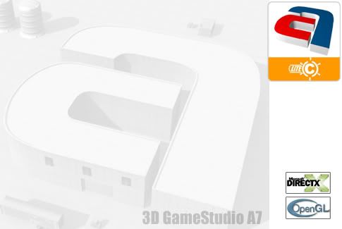
splash_screen(dark version):
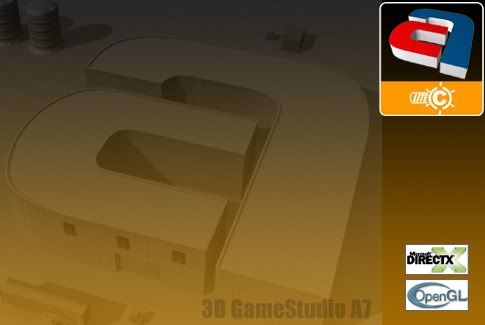
Posted By: FBL
Re: A7 logo contest - 02/11/07 17:17
OpenGL?
Posted By: Excessus
Re: A7 logo contest - 02/11/07 17:26
You can access the OpenGL API with lite-c
Posted By: FBL
Re: A7 logo contest - 02/11/07 17:52
But it's A7 contest
Nonetheless the logo and splash are great - although the a7 idea has been there before.
Posted By: HeelX
Re: A7 logo contest - 02/11/07 22:47
Though, white text on orange is appealing, I think your bulb logo has too much different "features", fighting to be the ultimate element of the bulb
there are cirlces, rays, curved brackets, lines all seperated from each other. I think you could improve it if you would melt some pieces together so that isnt a struggle for the viewer.
Posted By: GS_Raphael
Re: A7 logo contest - 02/11/07 23:14
Posted By: rojart
Re: A7 logo contest - 02/12/07 00:12
The same idea, but differently arranged.
Inestical: I create this A7 splash screen ingame logo now.
Germanunkol: Thank you for these observations this is the new example.


Posted By: capanno
Re: A7 logo contest - 02/12/07 09:17


update
Posted By: Salva
Re: A7 logo contest - 02/12/07 12:34
Hi!
Is there a New engine logo, or a new lamp system logo?
salva..
Posted By: HeelX
Re: A7 logo contest - 02/12/07 12:44
I made a new bulb concept and this turned into two new logo designs. The ray design is a more playful pattern, though, I tried to keep it serious (I like especially the black versions of these new designs).


I hope you like, enjoy!
Cheers and a nice one,
Christian
Posted By: Damocles
Re: A7 logo contest - 02/12/07 13:07
Posted By: broozar
Re: A7 logo contest - 02/12/07 13:14
sogar licht - c passt
Quote:

LOL
Posted By: SFMAT4
Re: A7 logo contest - 02/12/07 17:01
Quote:
I made a new bulb concept and this turned into two new logo designs. The ray design is a more playful pattern, though, I tried to keep it serious (I like especially the black versions of these new designs).
realy nice designs heelX but i�m missing the "3D" part in your screens.
Posted By: GS_Raphael
Re: A7 logo contest - 02/12/07 17:05
in my opinion it isnt the only goal to make a logo *serious* , it should be remarkable too. it needs a unique stile to get a *oh, yes, thats acknex* effect
look at this made by waldemar klassen:

Posted By: Germanunkol
Re: A7 logo contest - 02/12/07 17:50
LOL...
I totally agree... uniqueness is important. U sure that type of uniqueness will attract users though?
Posted By: HeelX
Re: A7 logo contest - 02/12/07 18:20
Quote:
realy nice designs heelX but i�m missing the "3D" part in your screens
Thanks, but do you really miss it? I heared so many people saying that they dont like that 3D "part" of my designs. Uhm, maybe I'll do it tomorrow to suit your needs ... originally I thought that the problem for rejecting my other entries would be that they are "a bit" or totally 3D. So I even considered when preparing my final entry-portfolio, that I'll do as well all logos vector based in 2D for print media as well. MAN! you are confusing me.
Posted By: SlyBoots
Re: A7 logo contest - 02/12/07 22:03
Quote:
I made a new bulb concept and this turned into two new logo designs. The ray design is a more playful pattern, though, I tried to keep it serious (I like especially the black versions of these new designs).
(images)
(images)
I hope you like, enjoy!
Cheers and a nice one,
Christian
I think those are great! Very slick and professional looking.
Posted By: HeelX
Re: A7 logo contest - 02/12/07 23:38
Thank you!
On SFMATs request I duplicated the files and reconfigured them to be 3D (additional material work, object depths, lightening). The ray-logo didnt took benefit from it, so I didnt touched them. The other ones are looking kinda different, especially the grey one looks even better and the red plate on white ground got a shine transition, looks a bit polished (its not too obvious, but you can notice the shiny orange if you want to). I think the first black version was better, but just translating it into 3D didnt hooked me, so I played a bit and well, this came out, not too bad, but the black 2D version is still dominating the 3D variation.
But vote for yourself:

Cheers,
Christian
[EDIT]
Raphael, tell your friend, that if someone would watch his computer screen, the reflection would be horizontally switched. Oh, and I suppose that a geek would name his models very confusely.. "untitled" is a bit too lame
I would have great respect for anyone who would invert his screen in any direction and he can still work with a dececent workflow ^^ ... I dont know but exactly in this very second I'm missing Ulilillia. Where is he?
Posted By: ello
Re: A7 logo contest - 02/13/07 10:11
ok, here is a more serious version. thought about creating the lightbulb's turn out of the A7:


see the C creating an eye...
Posted By: Uhrwerk
Re: A7 logo contest - 02/13/07 15:11
@HeelX: Wow, those last ones look damn hot!
Posted By: HeelX
Re: A7 logo contest - 02/13/07 16:00
Thanks. BTW: can you easily "read" and watch the black logo? I read this topic on another CRT monitor and it was a bit hard for me to watch it, maybe the contrast adjustments were too high..
Posted By: DARKLORD
Re: A7 logo contest - 02/13/07 16:07
Great logos HeelX.
I tried it with different screen settings and it was always readable.
Posted By: beegee
Re: A7 logo contest - 02/13/07 17:08
Quote:
I dont know but exactly in this very second I'm missing Ulilillia. Where is he?
He left 3D GameStudio and don't want to get in contact with it anymore. I thought he would come back because of Lite-C. But as he said he got something much better: Visual C++. He don't have to put up with the limitations and annoyances of Gamestudio, because Visual c++ can cover all things. Plus, there is no need of MoleBox anymore. He wrote much more, but all in all, he didn't get along with the limitations of GS. With C he can do all what he want to get.
Posted By: Damocles
Re: A7 logo contest - 02/14/07 03:12
Seams a valid choice, since he made a 2D game anyways, there is no real need for
a 3D Engine.
Posted By: ventilator
Re: A7 logo contest - 02/14/07 07:13
Posted By: ello
Re: A7 logo contest - 02/14/07 07:19
that is a cool approach
Posted By: FBL
Re: A7 logo contest - 02/14/07 18:43
I really like the idea - but I don't like the way you wrote A7.
Posted By: frazzle
Re: A7 logo contest - 02/14/07 19:51
Indeed a nice concept ventilator, it looks nice and it seems very pro
Cheers
Frazzle
Posted By: AWD
Re: A7 logo contest - 02/15/07 01:00
nice images
Posted By: checkbutton
Re: A7 logo contest - 02/15/07 08:38
@HeelX: Can you mix your Ray-background pattern with your 3d-style logos, please? I would like to see how it looks.
P.S.: Yes, the black logo is a little bit too dark.
I like all the concepts of Ventilator. The latest one is perfect for a logo and the other ones are nice splash screens.
My respect goes to many participants of this thread but I am really surprised of Ventilator's works.
Regards
Posted By: HeelX
Re: A7 logo contest - 02/15/07 14:04
Quote:
@HeelX: Can you mix your Ray-background pattern with your 3d-style logos, please? I would like to see how it looks.
When I just made the white ray pattern into 3D, I realized that it looks dumb. So I played with some materials and added a nice mac style - background pattern to it. I like especially the shiny surface of the red plate and the ray-frame which is brushed metal.

Should I convert the black version too? [EDIT] NO, I won't. In black it looks really really dumb.
Enjoy! and have a good one!
Cheers, Christian
Posted By: broozar
Re: A7 logo contest - 02/15/07 15:22
only 4 more days to go.
Posted By: er_willy
Re: A7 logo contest - 02/15/07 17:19


all in vectorial, any change of color, size in a one click.
free icons
some sugeris for the colors, sizes? please
Posted By: LWD
Re: A7 logo contest - 02/16/07 02:13
I can post more than one logo?
Thanks
Posted By: PHeMoX
Re: A7 logo contest - 02/16/07 02:32
Quote:
When I just made the white ray pattern into 3D, I realized that it looks dumb. So I played with some materials and added a nice mac style - background pattern to it. I like especially the shiny surface of the red plate and the ray-frame which is brushed metal.
It looks good, but those details you mention are hardly visible, I also doubt if it will be when this will be converted to 8-bit as a start-up screen.
Some last entries of mine;
White one:

Black one:

Cheers
Posted By: HeelX
Re: A7 logo contest - 02/16/07 08:18
Quote:
It looks good, but those details you mention are hardly visible, I also doubt if it will be when this will be converted to 8-bit as a start-up screen.
Thank you!
I dont see your problem: I use only greyscale colors and a bit red. In my graphics application I am used to I can use some tricky 8bit color conversion algorithms to make it as optimized as possible. Look, here is my last entry in 8bit. You were right, it was too bright, so I darkened it a bit and raised the contrast:

If you dont believe it: its a GIF with true an 8bit colortable! Download it and see yourself. So, in fact all of my entries are designed to have smooth color transitions for style reasons, but not so many colors, so that 8bit versions suck. OK, the image which would be used on the starter or in the tools will be smaller, but if the "8bit-quality" is on my big versions high enough I doubt that the quality will be bad on smaller sized versions.
Hm.. I like my shiny little red plate I will have a look if it looks good as well on my other entries
Cheers and a have a good one!
Christian
[EDIT]
I see some typical "GIF" color artifacts on the transitionsof the background. Well, no matter, I guess the 8bit version would'nt have the background instead of a tga splashscreen ingame or so.. whatever.
Posted By: broozar
Re: A7 logo contest - 02/16/07 09:17
last word from me...


and yes, it's 8-bit capable.
Posted By: inFusion
Re: A7 logo contest - 02/16/07 17:21
Posted By: CBFX
Re: A7 logo contest - 02/16/07 17:49
@jcl
can we post more than one entry?
Posted By: inFusion
Re: A7 logo contest - 02/16/07 17:53
Posted By: PHeMoX
Re: A7 logo contest - 02/16/07 19:17
@HeelX: It's definately an improvement with the raised contrast. I have to say though and this is something I didn't thought about, my monitor is kinda bright too. At the moment I'm on a different pc and your old one looks better than I thought. Still, this one looks even better.
Cheers
Posted By: broozar
Re: A7 logo contest - 02/16/07 19:21
@stein: i miss the bulb...
Posted By: Endgegner
Re: A7 logo contest - 02/16/07 19:49
Now if you change the text into "Mao say: Buy GameStudio A7!" I'm VERY happy, Stein Im Ofen ^^.
my last one:

Posted By: HeelX
Re: A7 logo contest - 02/17/07 00:39
Quote:

This is hilarous! Here is a blue version with added bulb Just kiddin'..

But there's no "A7" in the blue one, that won't count
Posted By: mpde
Re: A7 logo contest - 02/17/07 10:03
Hallo...
logo light

splash light

splash light++

logo dark

splash dark

splash dark++

mpde
Posted By: Salva
Re: A7 logo contest - 02/17/07 11:35
Hi!
A question: the lamp (bulb) is obligatory, or could be left?
greet..
salva
Posted By: broozar
Re: A7 logo contest - 02/17/07 11:47
is a must-have, loom at JCLs first post
Posted By: Salva
Re: A7 logo contest - 02/17/07 13:59
Hi!
I have looked for also of do anything, it is not a masterpiece. but I think that it knows, what it wants.
;
Greet..
Salva

Posted By: er_willy
Re: A7 logo contest - 02/17/07 14:38
Posted By: ventilator
Re: A7 logo contest - 02/17/07 15:28
Posted By: D3D
Re: A7 logo contest - 02/17/07 16:36
They become better and professional looking, more fun too! I wonder if it will be possible to select multiple banners instead of just one?! For fun I go for this one, they really should put a warning on the banner like this yes
Posted By: jrhlev
Re: A7 logo contest - 02/18/07 00:37
Hi everyone!


Posted By: Germanunkol
Re: A7 logo contest - 02/18/07 08:48
The idea:
A7... leading from the concept, the raw mesh, the idea, to the finished game.
Fades to white/black.


Alternative Dark Banner:

Posted By: Efrint
Re: A7 logo contest - 02/18/07 08:56
Hello,
this is my idea:


Posted By: jrhlev
Re: A7 logo contest - 02/18/07 13:05
Wow! I really like Germanunkol's white logo with the black hand. But I think the lightbulb looks a bit "displaced" (especially in the light banner) because it's not connected to the rest of the logo.
Besides this the logo works very well...
jns
Posted By: Salva
Re: A7 logo contest - 02/18/07 13:19
Hi!
Or maybe in this way?


greet.
Salva
Posted By: mpde
Re: A7 logo contest - 02/18/07 15:08
Hallo...
logo light

splash light

logo dark

splash dark

Wie alle meine Vorschl�ge in 8bit und der geforderten Gr��e.
mpde
Posted By: Salva
Re: A7 logo contest - 02/18/07 15:43
Hi!
Nice work, but I have seen many many logo here some with the written acknex some with the written 3d Gamestudio, it seem me that Mr. Lotter have told the use only an A7 and the symbol of the bulb for the lite-c, or I have understood bad?
greet
salva
Posted By: Chris3D
Re: A7 logo contest - 02/18/07 15:54
Hi!
My idea:
I want to create a connection between the human being and the 3d program; when you want to see the power of A7 with your own eyes, you need to illuminate it with the "c-lite" light bulb:
The square logos:


The banner logos:


In 8bit:


Greetings,
Chris
Posted By: HeelX
Re: A7 logo contest - 02/18/07 16:01
Quote:
My idea:
I want to create a connection between the human being and the 3d program; when you want to see the power of A7 with your own eyes, you need to illuminate it with the "c-lite" light bulb
Weird!.. your bulb looks like a tear
Posted By: giorgi3
Re: A7 logo contest - 02/18/07 16:02
Posted By: FBL
Re: A7 logo contest - 02/18/07 16:45
Interesting idea, unfotunately it won't be clear for many people right away (I think). Additionally the 7 could be misread as 1.
Posted By: giorgi3
Re: A7 logo contest - 02/18/07 18:15
Yeah, probably not. But i have one of the new twisty floresent lightbulbs and thought it might be interesting to try with it.
Posted By: SFMAT4
Re: A7 logo contest - 02/18/07 20:11
Posted By: AWD
Re: A7 logo contest - 02/18/07 21:05
I have two logos:
1st:
Light:

Dark:

2nd:
Light:

Dark:

I can edit the slogan or somheting thus, if you want...
And i give the PSD file (Phothoshop file) if you want to edit something (slogan or anything).
Posted By: Salva
Re: A7 logo contest - 02/18/07 21:07
Here.. an other image. it is good this? if yes I will continue
otherwise enough.

Greet..
Salva
Posted By: JeyKey II
Re: A7 logo contest - 02/18/07 21:10
Posted By: Salva
Re: A7 logo contest - 02/18/07 21:16
Posted By: JeyKey II
Re: A7 logo contest - 02/18/07 21:18
Posted By: HeelX
Re: A7 logo contest - 02/18/07 21:51
[I removed it for some serious issues]
Posted By: FBL
Re: A7 logo contest - 02/18/07 23:02
create some sort of price label andput A7 on
Posted By: SFMAT4
Re: A7 logo contest - 02/18/07 23:18
Quote:
bulbs! BULBS! everywhere bulbs! I'm going nuts, I see them everywhere, ahh even my deepest desires are going crazy.. look, I'm kinda freakin out:
BULBS!
...
Quote:
We only have two requirements for the content. We need an "A7" of course, and we need at least one light bulb somewhere in the image.
Posted By: JeyKey II
Re: A7 logo contest - 02/18/07 23:28
Posted By: HeelX
Re: A7 logo contest - 02/18/07 23:39
Quote:
...
It was a joke.. you know.. girls.. and bulbs.. you know.. whatever. I removed it. Though, I liked it ^^
Posted By: JeyKey II
Re: A7 logo contest - 02/18/07 23:57
SFMat's logos are amazing.
Posted By: broozar
Re: A7 logo contest - 02/19/07 08:22
indeed, but i doubt they will look good in �
Quote:
8 bit, so too many smooth color or brightness ranges should also be avoided.
Posted By: SFMAT4
Re: A7 logo contest - 02/19/07 10:50
hey HeelX also just fun
Posted By: er_willy
Re: A7 logo contest - 02/19/07 11:04
8 bit is enought for SFMAT4 logos
this a 8 bit gif of my wining horse

Posted By: JibbSmart
Re: A7 logo contest - 02/19/07 11:17
19th of February... im eager to find out the winner!
julz
Posted By: Inestical
Re: A7 logo contest - 02/19/07 11:40
the voting starts today.. wheeeh.. I'm pretty sure my entry won't be shown in the poll
Posted By: frazzle
Re: A7 logo contest - 02/19/07 12:42
Quote:
the voting starts today.. wheeeh.. I'm pretty sure my entry won't be shown in the poll
I'm quite curious how the poll will be done because I think we have over the 100 entries
Cheers
Frazzle
Posted By: HeelX
Re: A7 logo contest - 02/19/07 12:44
I would suggest that Conitec decides this internally. A public vote for such an important question is maybe not the right way.
Though, if they do it that way, I suppose to create a vote wheres you can set 3 or 4 votes.
Posted By: Damarus
Re: A7 logo contest - 02/19/07 13:19
My feeling says thats its gonna take a long time one way or the other to decide with what logo they go.
Posted By: Germanunkol
Re: A7 logo contest - 02/19/07 13:44
They can't make this a public vote, can they? Cause people could log on multiple times etc... that wouldn't work...
?
Posted By: Shinobi
Re: A7 logo contest - 02/19/07 13:47
Is it over today or tomorrow ? i know its the last day but not sure if we can still show something or not .
Posted By: er_willy
Re: A7 logo contest - 02/19/07 14:10
but finnish mornig?
I thik what us can put logos today
not?
Posted By: PHeMoX
Re: A7 logo contest - 02/19/07 14:20
Quote:
I would suggest that Conitec decides this internally. A public vote for such an important question is maybe not the right way.
Yeah, let's vote for internal voting by Conitec, that way we did some voting too. Ah btw you got my vote,
Cheers
Posted By: TripleX
Re: A7 logo contest - 02/19/07 14:59
Quote:


I know..don't quote images.. But these ones are really fantastic..
I don't really like the other one with the screens on the cubes, because it's too genre specific and would really fit into a child-game for example.
Posted By: SFMAT4
Re: A7 logo contest - 02/19/07 15:01
I have participated in an similar contest a few years ago. There was an open poll for all users on the Forum. The result: They delete the poll, determine the winner internaly and they never do a contest like these again.
I hope one of mine gets at least into the top 10
GO conitec GO!
Posted By: ventilator
Re: A7 logo contest - 02/19/07 15:08
i like the second one in triplex' quote but they (and a lot of other entries) aren't in the format jcl wanted. you did the complete splash window but where should the engine start-up messages go there?
Posted By: er_willy
Re: A7 logo contest - 02/19/07 15:14
my last shot


my vote for SFMAT4 logos
Posted By: HeelX
Re: A7 logo contest - 02/19/07 15:14
Well, I like those renderings (I am still not getting the icecube idea ^^) of SFMAT, great!
Though, I am still confused by his A7/bulb lets-intermingle-it logo. Honestly, its hard to look at - I mean, it makes me look away everytime I want to focus on it: maybe its the coloring (try completely white ellipses and another shadowing, plus, make the 7 black or dark grey) or the shape: the ellipsoid-chain of the bulb holder has a completely divergent swing than the streched ellipse of the "7" PLUS the orange 7 is also introducing a whole new viewing curve to the "reader" (+ shadow direction). So, I dont know why, but it makes me feel.. awkward. So, maybe if you add some more order to the view axis of your logo (the logo.. not the rest!) and the composition with the label (acknex 7), you could improve your logo a lot! (I think)
Cheers
Christian
I vote for that one or two logos that make(s) the whole product more serious.
Posted By: TripleX
Re: A7 logo contest - 02/19/07 15:23
In my opinion there shouldn't be one winner but maybe 2-3 complete different splashscreens (The ones of HeelX / Sfmat4 / Michael Schwarz and Wetain are my favorite ones). The user should be able to chose and use the best-fitting logo for his project.
Posted By: PHeMoX
Re: A7 logo contest - 02/19/07 15:29
Quote:
I have participated in an similar contest a few years ago. There was an open poll for all users on the Forum. The result: They delete the poll, determine the winner internaly and they never do a contest like these again.
I know, but since they did not say anything about it ...
Edit: Mmm, jcl said 'will be determined in one month from now', a poll would require more than a day of voting at least, so I take it he actually did say it was going to be internal voting. Good thing!
Cheers
Posted By: Salva
Re: A7 logo contest - 02/19/07 17:30
Hi!
I creed that the system that you tell is a little complicate for vote, from now, then the logo should be created from persons that are not part of the forum, they presents some logo and we vote them, because it seem me stupid that we same that create the logo should doing a self-vote? for my is correct that the conitec people vote for us, and win the best!!!
greet
Salva
Posted By: Joey
Re: A7 logo contest - 02/19/07 17:58
Posted By: CBFX
Re: A7 logo contest - 02/19/07 18:55
Posted By: Joey
Re: A7 logo contest - 02/19/07 19:33
good.
Posted By: ulf
Re: A7 logo contest - 02/19/07 19:50
okay another really late entry from me. made with inkscape. it represents a disk version of A7

Posted By: mpde
Re: A7 logo contest - 02/19/07 19:58
Hallo...
logo light und dark


splash light und dark


mpde
Posted By: Joey
Re: A7 logo contest - 02/19/07 20:07
@ulf: good one. at least one person out there uses inkscape as well
Posted By: Endgegner
Re: A7 logo contest - 02/19/07 20:27
Might as well give it another shot... Looks like me olde one anyway, only some little changes ^^.

Posted By: ulf
Re: A7 logo contest - 02/19/07 20:48
another "different" style from me...

...just kidding
Posted By: Endgegner
Re: A7 logo contest - 02/19/07 20:50
w00t that one rocks. ulf, you can consider yourself the winner of the contest ^^.
Posted By: FBL
Re: A7 logo contest - 02/19/07 20:54
I agree here
Posted By: AWD
Re: A7 logo contest - 02/19/07 21:44
Here is my other logos:
Light:

Dark:

Posted By: jcl
Only a few hours left... - 02/19/07 21:50
This is the last afternoon of the contest - only 8 hours left! Some of the entries have a good, professional quality - especially the simpler ones.
I'll open a new thread tomorrow for judging. I already have some favorites, but I'm curious which of all the entries you think is the best...
Posted By: Efrint
Re: Only a few hours left... - 02/19/07 22:21
Hello,
here is my second entry:
color:


and s/w:


I like them quite a bit
.
Regards
Efrint
Posted By: rojart
Re: Only a few hours left... - 02/19/07 23:00
Posted By: PHeMoX
Re: Only a few hours left... - 02/19/07 23:13
Rojart, yours is not visible, better upload it using imageshack.us or some similar free service,
Cheers
Posted By: broozar
Re: Only a few hours left... - 02/19/07 23:26
Posted By: rvL_eXile
Re: Only a few hours left... - 02/19/07 23:34
Take this Link for Rojars Pics -->
Here<---
Name of the Logos: Splash_B.png and Splash_W.png
cYa Sebastian
Posted By: Germanunkol
Re: Only a few hours left... - 02/19/07 23:37
hey, not bad rojart, not bad
the while(1) looks like a while(3), but that's fine^^...
I wonder what while(3) would do... I think it would never enter the loop.. oh well
thanks for hosting them, angel!
jrhlev, thanks a lot! I appreciate the comment
Micha
Posted By: AWD
Re: Only a few hours left... - 02/19/07 23:43
There my last images:
Light:

Dark:

Posted By: AWD
Re: Only a few hours left... - 02/20/07 00:45
other version:
Light:

Dark:

Posted By: EX Citer
Re: Only a few hours left... - 02/20/07 13:13