|
2 registered members (Akow, tomaslolo),
1,536
guests, and 12
spiders. |
|
Key:
Admin,
Global Mod,
Mod
|
|
|
 Re: A7 logo contest
[Re: TripleX]
#108189
Re: A7 logo contest
[Re: TripleX]
#108189
02/19/07 15:14
02/19/07 15:14
|
Joined: Jul 2001
Posts: 6,904
HeelX

Senior Expert
|
Senior Expert
Joined: Jul 2001
Posts: 6,904
|
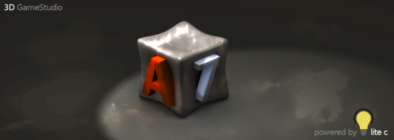
Well, I like those renderings (I am still not getting the icecube idea ^^) of SFMAT, great!
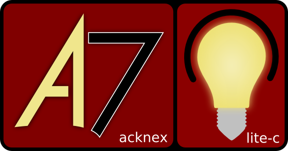
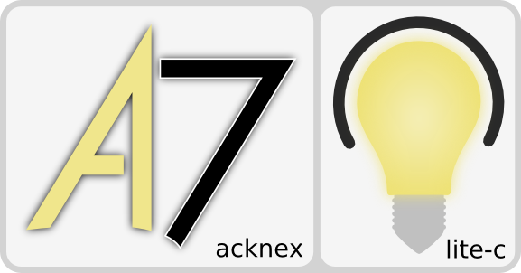
Though, I am still confused by his A7/bulb lets-intermingle-it logo. Honestly, its hard to look at - I mean, it makes me look away everytime I want to focus on it: maybe its the coloring (try completely white ellipses and another shadowing, plus, make the 7 black or dark grey) or the shape: the ellipsoid-chain of the bulb holder has a completely divergent swing than the streched ellipse of the "7" PLUS the orange 7 is also introducing a whole new viewing curve to the "reader" (+ shadow direction). So, I dont know why, but it makes me feel.. awkward. So, maybe if you add some more order to the view axis of your logo (the logo.. not the rest!) and the composition with the label (acknex 7), you could improve your logo a lot! (I think)
Cheers
Christian
I vote for that one or two logos that make(s) the whole product more serious.
Last edited by HeelX; 02/19/07 15:17.
|
|
|
Re: A7 logo contest
[Re: PHeMoX]
#108192
02/19/07 17:30
02/19/07 17:30
|
Joined: Aug 2002
Posts: 375
Germany
Salva
Senior Member
|
Senior Member
Joined: Aug 2002
Posts: 375
Germany
|
Hi! I creed that the system that you tell is a little complicate for vote, from now, then the logo should be created from persons that are not part of the forum, they presents some logo and we vote them, because it seem me stupid that we same that create the logo should doing a self-vote? for my is correct that the conitec people vote for us, and win the best!!!  greet Salva
|
|
|
Re: A7 logo contest
[Re: Joey]
#108194
02/19/07 18:55
02/19/07 18:55
|
Joined: Jan 2006
Posts: 3
CBFX
Guest
|
Guest
Joined: Jan 2006
Posts: 3
|
|
|
|
|


")